
The New Workflow Report
The New Workflow Report
Jonny Goodall
Chief Experience Officer
08.06.26
Our Chief Experience Officer, Jonny Goodall, shares his point of view as part of The Drum and Adobe’s The New Workflow report, exploring how teams can work better together in a world of AI-enabled tools, connected documents and increasing pressure to deliver more, faster.
The report looks at a familiar challenge for modern businesses. Work moves through briefs, decks, proposals, insights, contracts, brand guidelines and strategy documents, but too often those materials sit across disconnected tools and systems. Teams lose time searching, summarising, reformatting and realigning, when that energy could be spent making better decisions and better work.
For us, the interesting question is not simply how AI makes workflows faster. It is how it helps teams stay focused, connected and creatively effective at speed.
Jonny’s view is that AI is changing the pace of design and delivery, but not the purpose of it. Brands can now move from thinking to prototyping to production at a speed that would have been difficult to imagine only a few years ago. But speed alone is not the answer.
The real challenge is making sure that every output still feels true to the brand.
As more work becomes automated, assisted and generated across different teams and tools, brands need stronger systems, clearer principles and better guardrails. Not to slow teams down, but to give them the confidence to move faster without creating drift.
That means the role of design is changing too. It is no longer just about crafting individual outputs. It is about designing the conditions for consistency – the behaviours, patterns, systems and decision-making frameworks that help every experience stay connected to the brand, wherever and however it appears.
At Bernadette, this is central to how we think about the future of digital experience. AI can remove friction, accelerate production and unlock new forms of collaboration, but the value still comes from human judgement: understanding the customer, the market, the brand and the moment.
The best workflows will not be the ones that simply generate the most. They will be the ones that help teams make sharper decisions, protect brand distinctiveness and create digital experiences that feel useful, coherent and alive.
Because the future of work is not just faster – It’s more connected, more responsive and more dependent than ever on knowing why you are making something in the first place.
Read the full report from The Drum and Adobe here: https://report.thedrum.com/adobe-the-new-workflow/

Onboarding Claude
Onboarding Claude: What our recent hires are teaching us about the future of design
Andrew Heirons
Product Design Lead
28.04.26
Bernadette has been prototyping some new team shapes, and we’ve recently brought in a few new hires. Alongside Google Stitch, and Figma Make, our newest recruit is Claude. They all had a strong portfolio, experience delivering complex experiences for unique brands and importantly had boundless energy to go above and beyond. But there’s something particularly exciting about Claude.
Most designers would baulk at the dreaded words ‘have fun with it’ – but by combining Claude Code, MCP servers and Claude Design – our new colleague has revelled in the challenge. When given even a throwaway prompt they surprised and seriously impressed us. Full interactive experiences spun up in seconds – vivid visuals and surprising interactions delivered in design and code created near instantly.
But there was a hitch. The reality is that these results didn’t always connect the dots coherently. They feel more like a party trick than an effective experience. There were inspired moments among the generated outputs, but Claude’s wider vision often missed the nuance required to get a brand expression spot on. In their eagerness to impress us they confidently hallucinate entirely new brand assets (on occasion this is something that should be encouraged) – but this eagerness could be their biggest weakness.
Like in human teams collaboration is key, and we’ve found augmenting tools like Gemini, Figma Make and Claude together have delivered the most promising returns – each have their own personality quirks which can work with or against you. What has become clear is that a collaboration is essential, even between machines.
Gemini’s canvas is highly effective but is ultimately single player. Figma Make promises seamless design and prototyping, but is let down by its attention to detail. Claude’s design suite (particularly when connected to Figma’s MCP) feels like magic but overshoots and builds in too much complexity. What is clear is these tools will become more effective as they become more collaborative and more reliable – the same qualities we often look for in our human colleagues.
The transformational unlock (right now at least) is in focussed, functional tasks. Like anyone else in the team, the more guardrails and support we give them, the more likely the outcome will resonate. Designers have been rightfully proud of the manual craft behind beautiful documentation and systems, but Claude can eat this for breakfast. This unlocks precious hours by handing off the manual drudgery of spacing and system maintenance. The tools can also act as a superpowered sketchbook. They let us communicate interactive snapshots of an experience instantly. Ultimately this unshackles human teams, giving them time to be genuinely inventive and expressive, and to think bigger than tokens and corner radiuses.
This is where the real value lives; in finding the creative tension between human, market and brand truths. In making connections between categories, concepts and data sets. Some of which are not public, some of which require an inspired leap between disparate ideas. This is where you find effective and surprising solutions. This is where you find an idea.
Here is the reality: the tools are radically changing how we get there, but the why stays exactly the same. Customers don’t care what built or powers their experience; they want an experience that works, they want to feel connection, inclusion and trust. But the sheer velocity of this toolkit should be a massive wake-up call for businesses. We can now operate at a pace unthinkable a few years ago.
It’s worth noting that Generative AI isn’t limitless magic. The true cost of compute is becoming clear. The brief (and inevitably short-lived) infinite compute cheat has been patched. Finite resources require the same clear direction as anyone else in our team. But running out of credits (just like burning out a team) is a real and increasing risk when working with these tools. We’ve seen companies like Uber and MIcrosoft drive adoption of these tools at scale, and due to the cost now find themselves making pragmatic decisions about where and how they are being used. What is worrying is that when these anthropomorphised tools decide to go off-brief, they take no responsibility. Worse still they completely down tools when out of credits. This stifles creativity and creates very real blockers to delivery. Something the humans we work with do not.
At Bernadette we’re anticipating how roles and processes are changing. Horizons have shrunk. Brands and products can no longer plan in years, they need to be responding in days and weeks, not just with prototypes, but with final delivery. So we’re challenging brands to be truly responsive, enabled by these new AI tools, and working together with us.
Because whether your teammate is human or generative, the mandate is identical: move faster, adapt instantly, and never lose sight of why you’re building it in the first place.
Accessibility Collective
Accessibility Collective
Designing for Difference. Building for Everyone.
At Bernadette, accessibility isn’t a feature — it’s a foundation.
From UX and engineering to strategy and content, we design with difference in mind.
The Accessibility Collective is our industry award-winning initiative to explore, evolve and champion inclusive digital design — from practical tools to cultural shifts.
16%
of the global populationexperiences significant
disability (WHO)
35%
more benefit fromaccessible design due to
situational or temporary
needs (Forrester)
$6.9bn
lost each year by brandswith inaccessible websites
(McKinsey Digital)
Our Accessibility Approach
Grounded in real-world insight, powered by emerging tech. At Bernadette, we fuse rigorous accessibility standards with human-centred creativity — making inclusive design scalable, practical, and expressive.
- We co-create with disabled users, not just test after the fact. Every touchpoint is informed by lived experience, not just best practice.
- We use smart tools, applied thoughtfully — like AI-powered alt text generators and brand-trained tone-of-voice models — always keeping humans in the loop.
- We design for scale. Our modular, accessibility-first components can be integrated into existing platforms or launched as part of full redesigns, ensuring accessibility doesn’t get stuck behind a rebuild.
- We prioritise ethical implementation. That means representative training data, manual overrides, and user control as standard. Because accessibility without agency isn’t inclusion.
- We work to an internal UX, UI & Copy Accessibility Checklist to ensure consistency and quality across projects — covering everything from colour contrast and heading structure to interaction cues and reading level.
- We align with WCAG (Web Content Accessibility Guidelines) up to AAA level, wherever possible — helping clients meet legal, ethical, and human standards for inclusion.
Want to know how Bernadette can help make your product more accessible?
Whether you’re rethinking your content structure, planning your next platform build, or just looking for a fresh perspective — we’d love to hear from you.

Digital Experience Index
Digital Experience Index
The formula for creating world-class digital experiences
The Digital Experience Index benchmarks the best digital experiences across various industry sectors. Download the whitepaper for actionable insights on how to enhance your brand’s digital experience.
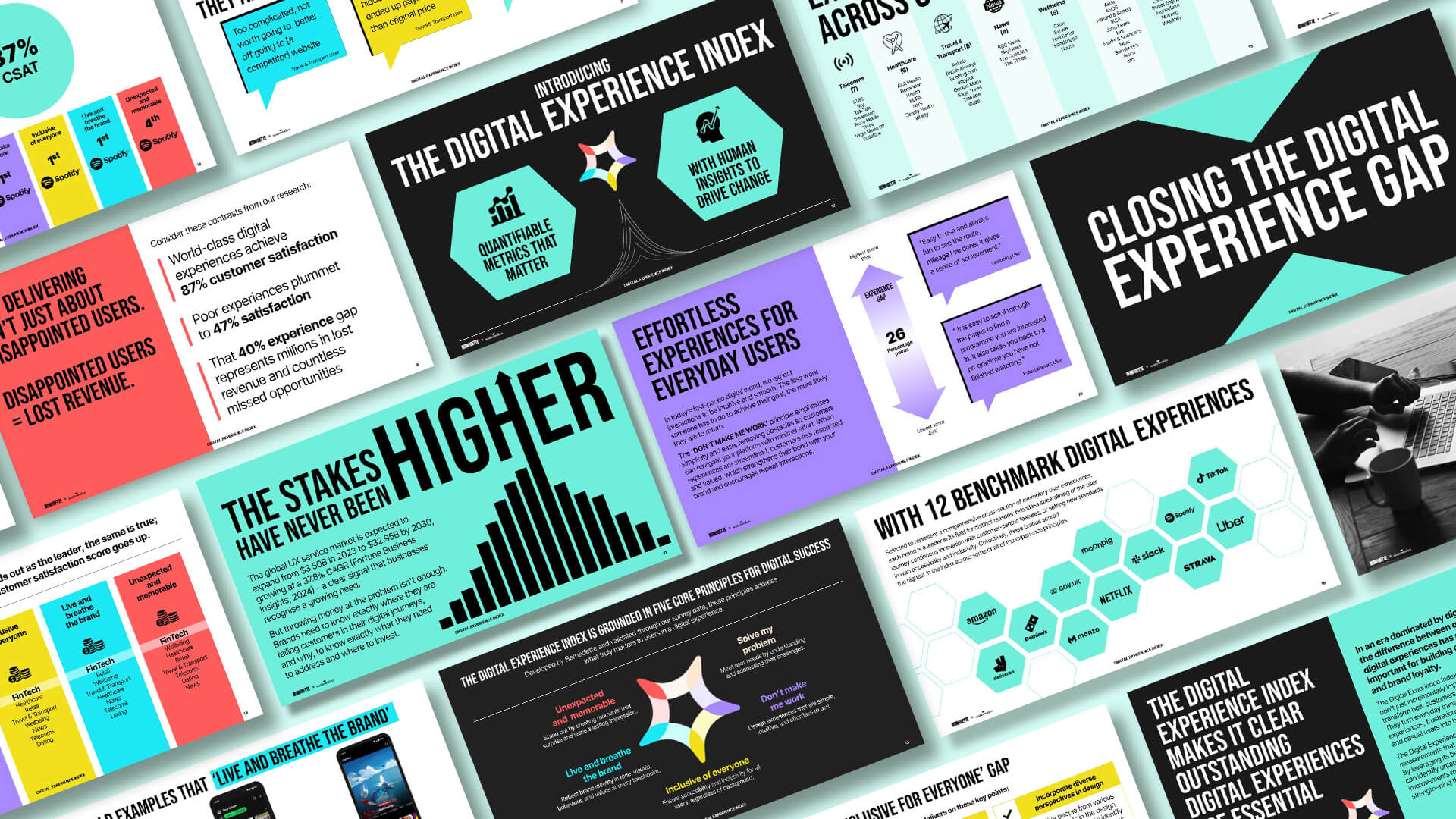
In a world where over 60% of consumer interactions with a brand happen online, yet 1 in 3 digital experiences leave customers unsatisfied, it is more important than ever for brands to understand where these interactions fall short. Introducing the Digital Experience Index, a tool designed to help brands measure, benchmark, and improve their online customer experience.

74
Brands

4.5k
People surveyed

1/3
Not satisfied
Our formula for success
Grounded in our 5 digital experience principles, we’ve identified 20 key drivers that measure how well a digital experience is performing in regards to customer satisfaction (CSAT). With tangible and actionable insights across the five principles, the index helps you understand how your current experience stacks up to other brands in your sector and what great looks like.
Our Five Digital Experience Principles
Solve my problem
Brands must make sure they meet user needs by truly understanding the challenges their customers face.
Don’t make me work
It’s vital that brands create experiences that are easy to use, simple to understand and require minimal effort.
Inclusive of everyone
Brands must bake web accessibility in, and ensure that language and content are inclusive of people from all backgrounds.
Live and breathe the brand
A brand should feel alive in the digital experience, with its tone of voice, aesthetics, behaviour, interaction patterns, values and more.
Unexpected and memorable
Average experiences are everywhere. Brands must strive to create moments that people will remember and talk about.
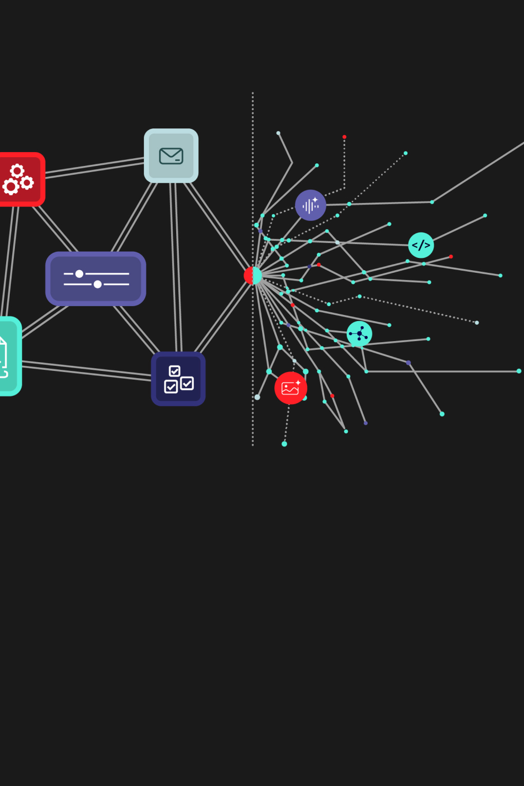
Access granted: How AI Is already making digital accessibility smarter
Access granted: How AI Is already making digital accessibility smarter
And why it’s not just generative — it’s agentic.
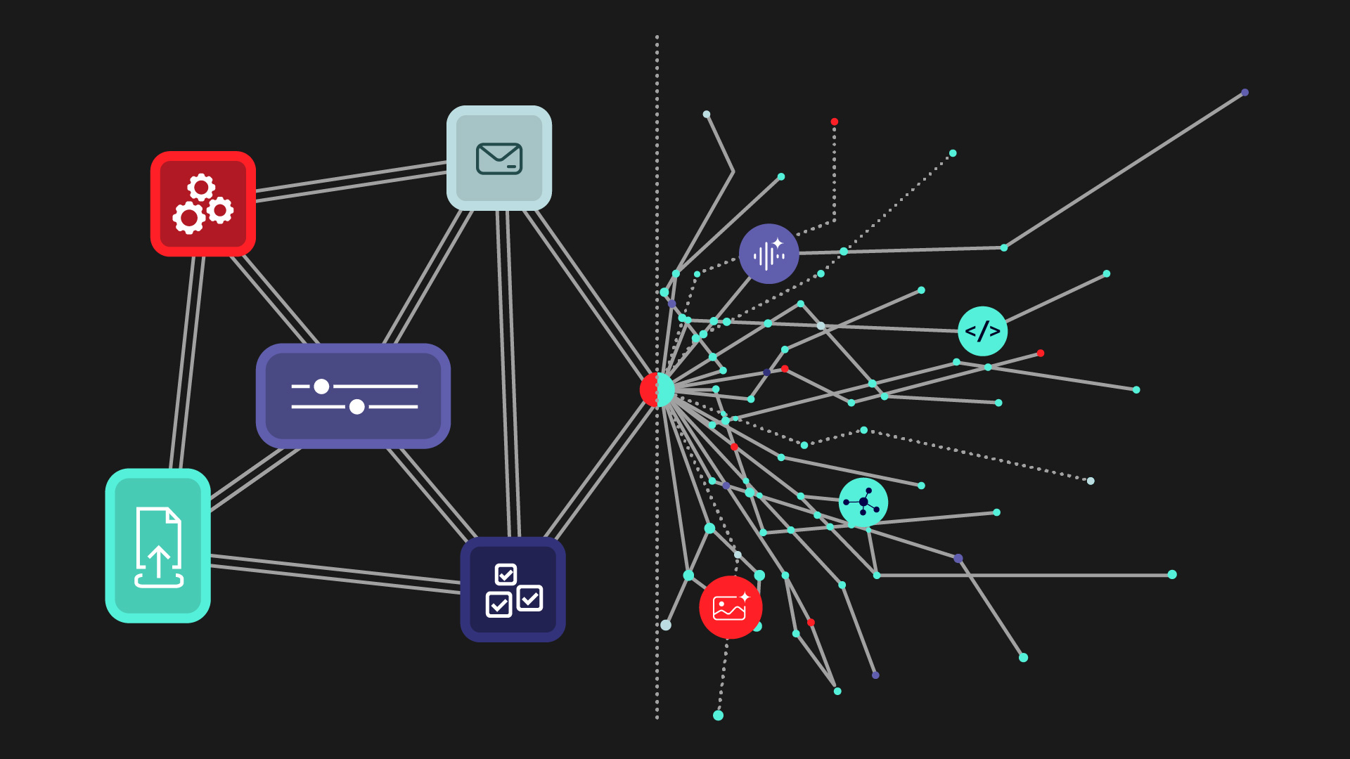
When AI and accessibility appear in the same sentence, the conversation often jumps to automation.
Can AI write alt text? Adjust contrast? Fix code? Increasingly, yes. But at Bernadette, we believe the real opportunity for accessible design goes far beyond quick fixes and accelerating workflows.
While it’s true that generative AI is already helping us automate and augment traditional accessibility standards, we’re also looking ahead — to a digital future shaped by sophisticated user-facing AI agents and action models powered by autonomous, decision-making systems ready to act on the behalf of users and adapt to their needs in real time.
That’s why we’ve already begun to prototype what we call ‘artificially mindful interfaces’ — context-aware features that pre-empt barriers to respond with greater nuance, personalisation and immediacy.
And, as we continue to scope the potential this next generation of assistive technologies is set to deliver, we’re staking out creative opportunities — not just for the accessible web, but for the world beyond the screen. But before we get ahead of ourselves, let’s take a look at how AI is reshaping accessibility right now — and how brands can start thinking more ambitiously about AI-driven inclusive design, from the ground up.
How AI is rewriting the accessibility playbook
While the commentary around AI often feels future-focused, many meaningful shifts are already happening — quietly, practically, and behind the scenes.
At Bernadette, we’re already integrating AI into the everyday tools and workflows that shape accessible digital experiences. From real-time semantic markup validation to smart alt-tag suggestions, we’re using generative systems to identify gaps, flag risks, and guide better defaults — all without slowing down the pace of design.
AI-powered plugins now sit inside our design environments — helping us spot contrast issues in real time, generate accessible components, and pre-empt code-level WCAG violations before they reach QA. This initiative extends to the use of a customised prompt library designed to boost accessibility essentials such as screen-reader compatibility and keyboard navigation — ensuring inclusive interaction from the very first design draft.
All of this is scalable from project to project which allows us to maintain a consistent level of rigour whatever we’re working on. Whether we’re supporting a full platform overhaul or a lightweight microsite, these tools help us align with evolving benchmarks like WCAG 2.2 and prepare for new regulatory shifts like the European Accessibility Act (EAA) — without starting from scratch every time.
The result? Faster prototyping. Fewer reworks. And a stronger foundation for inclusive design that adapts as legislation and user needs continue to change.
How AI is empowering users directly
But perhaps the real breakthroughs aren’t in how AI is helping creatives meet industry standards — but rather how it’s already reshaping experiences and improving lives on the other side of the screen. Thanks to the adaptable nature of these generative tools, developers are finding new ways to meet the longstanding accessibility needs of specific user groups. This has led to a seismic shift toward digital environments and applications that are universally easier to navigate, especially for those historically overlooked by traditional systems.
Neurodivergent users, for example, are now able to access written content that rewrites itself on demand — adjusting tone and structure in real time and breaking down dense material into focused, digestible summaries if the system detects a dip in concentration.
In fact, when it comes to accessible language, our own work on Kia’s Virtual Assistant set a new benchmark for real-time web messaging in the automotive sector. In collaboration with a third party, we developed a custom-trained large language model (LLM) calibrated to Kia’s tone of voice — with a cadence, clarity, and conversational logic designed to support inclusion and readability from the ground up. The assistant responded with clarity, followed up on incomplete queries, and adapted to a wide range of user needs — making every exchange more accessible, intuitive, and human.
For those with more significant sensory impairments — where both reading and interpreting visual context present challenges — we’re now seeing even more powerful AI-driven tools emerging to meet the moment. A standout example is Be My AI: a GPT‑4 assistant embedded in the Be My Eyes app. Designed for blind and low-vision users, it goes far beyond simply describing images. It understands their context, unpacks cluttered layouts, answers follow-up questions, and — in a sign of where AI is headed — even suggests next steps, like recommending recipes based on what’s in your fridge.
Likewise, for deaf people, the UK startup Silence Speaks is closing the gap in BSL interpretation — with an AI avatar translates text, speech, and video into British Sign Language with remarkable fluency, trained not just on vocabulary, but on regional dialects, emotional tone, and real-world signing speed.
These examples show how AI is already transforming what’s possible on screen — but beyond the browser, it’s also helping build the connective tissue between people and their environments. From powering prosthetic devices that adapt to movement patterns, to creating contextual navigation tools for low-vision users, to voice-controlled smart home systems that respond to non-verbal cues or gestures, the reach of AI is expanding rapidly.
These solutions point to a broader definition of tech-assisted accessibility — and it’s this breadth of application, permeating the physical world, our homes, public spaces, and even our own bodies, that looks set to define the future of accessible design — and that’s already giving us some big ideas.
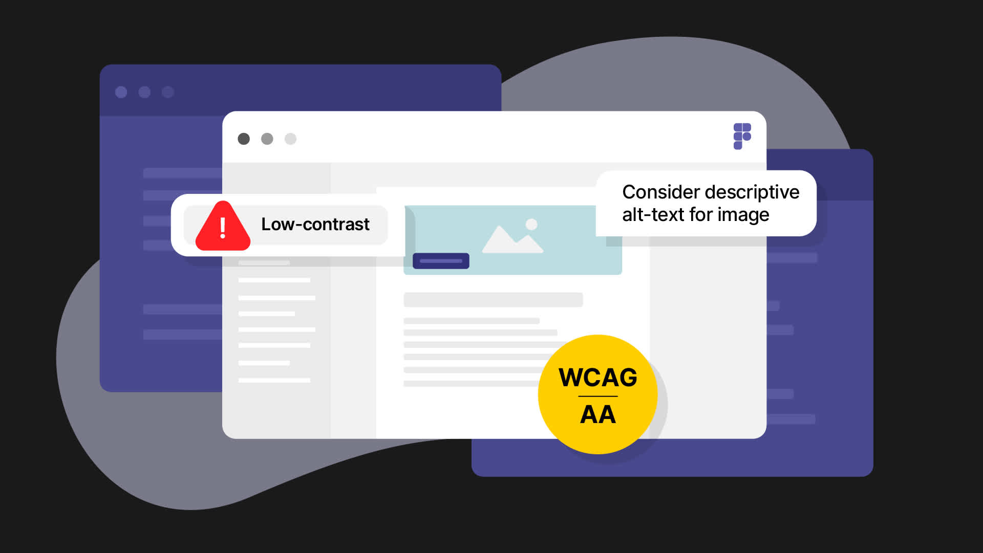
The shift to truly adaptive design
As impressive as today’s tools might seem, they’re only the beginning.
We’re anticipating the next evolution in AI — pre-emptive systems that won’t just generate content or audit interfaces on request, but will operate proactively on behalf of the user. This is the emerging realm of agentic AI: intelligent systems that interpret context, anticipate needs, and take meaningful action autonomously.
Literally, these agents are learning to read the room — as well as the screen — and respond accordingly based on context and reasoning. And for accessibility, that’s a game-changer.
Imagine an interface that doesn’t just flag a contrast issue — it corrects it automatically, based on ambient light or time of day. A reading assistant that senses when your attention dips and rewrites a dense paragraph into something shorter, clearer, more digestible. Or a navigation tool that doesn’t just react to your inputs — it understands your habits, your stress signals, even your routine, and guides you accordingly.
And it’s not just interfaces that are set to evolve — even typography is on the cusp of becoming responsive. In its 2025 Re:Vision trends report, Monotype — the global type giant behind Helvetica — explores how AI could soon drive ‘reactive type systems’ that adapt to emotional and environmental cues. Fonts might sharpen when you’re focused, soften when your gaze drifts, shift contrast based on light levels, or adjust emphasis depending on reading speed and comprehension. It’s a speculative but powerful vision: text that flexes in real time to meet you where you are — cognitively, visually, emotionally. As with all agentic design, the end goal isn’t just automation — it’s deeper connection through intelligent, human-aware interaction.
All of this points to a future of accessible design that’s increasingly about building systems that adapt to people — emotionally, cognitively, physically — rather than asking people to adapt to the system.
At Bernadette, agentic AI is an emerging concept that we’re watching closely. We’re not claiming to have all the answers — yet. But by embedding curiosity, ethics, and experimentation into our design process, we’re already laying the groundwork for a future where smarter tech is bringing new digital experiences to life — for everyone.
What this means for Bernadette clients
Whether we’re launching immersive campaigns like My Cadbury Era, powering platforms through O2’s Oxygen design system, or deploying Daisy — a fraud-fighting AI “granny” who chats with scammers to protect vulnerable users — we apply the same AI-enhanced accessibility standards across every brand and deliverable, with each and every output benefiting from accessible component libraries by default.
But for clients working with Bernadette, the opportunity isn’t just to meet today’s standards but to help shape tomorrow’s by exploring the impact on people and brands. In this way, we’re looking to unlock the creative potential of AI-driven inclusive design and emotionally intelligent experiences, together.


Our approach to Accessible & Inclusive Design
Our approach to Accessible & Inclusive Design
We believe that as a digital industry, it’s our duty to ensure that people of all abilities and backgrounds can use the digital experiences we create - from apps to chatbots, software to wearables - everybody has the right to use and enjoy each and every one of them.
Web accessibility is about making sure that websites and apps can be used and understood by everybody, regardless of which device or screen someone is using, their ability, circumstance, or background. In the UK, around 18% of the population are disabled (2021 Census), that’s 9.8 million people in the UK alone. Plus we estimate that when you include factors that are generally not associated with the word ‘disability’ – such as neurodiversity, speaking English as a second language and colour blindness – that it’s probably far closer to 50% of the population who have specific web accessibility needs.
Inclusive Design encompasses accessibility, but is even broader still – it is about making sure that people feel welcome within an experience, feel represented and catered for – it covers a broad range of themes within the world of diversity and inclusion such as gender, neurodiversity, ethnicity and sexuality. It’s hard to put a statistic around the number of people who are most commonly affected by exclusion, but we’re confident that it will be an incredibly high percentage as the majority of people have experienced some form of exclusion at some point in their lives.
Oh, and did we mention that everybody benefits from accessible and inclusive design? The brilliance of these two practices is that they make experiences better for everyone.
AA level accessibility is required by law
From June 28th 2025, it will be law for both public and private sector websites and apps to be at least AA accessible (Not sure what AA means? Download our cheatsheet). It’s already law to be at least AA for the public sector and organisations aimed towards people with accessibility needs – such as gov.uk or RNIB – and many public sites will aim for the even higher standard of AAA.
Brand and Inclusive Design - Never compromised
We are part of the VCCP Group – a network of agencies that pride themselves on engaging with customers and audiences of businesses big and small – and we are hugely passionate about brands and the strength a brand gives to your business and its presence. We always strive to bring brands to life within digital experiences and to bring the same creativity you would use in advertising and communications, to the digital product design world.
Sadly, accessible design has a bit of a negative reputation for being boring and constraining brand creativity. However, we believe that brands should never be compromised, and neither should accessible or inclusive design – they are equally important to really engage all of your customers properly.
Then combine this with a recent survey by Nice that revealed 37% of consumers will abandon a brand due to poor customer experience. More consideration and application of accessible design principles is not just about benefiting the 21% of the population with web accessibility needs. Failing to prioritise user-friendly experiences will harm customer satisfaction and will damage your brand reputation.
Accessibility is often treated as a compliance issue or technical task, overlooked in favour of aesthetics being the draw for people to engage with your brand. However, great accessibility and inclusivity doesn’t compromise aesthetics. It works with it, and compliments it, while putting in the right functionality for your business to be accessible to more people – if anything, it elevates your brand’s appeal beyond aesthetic attraction alone. Beyond legal requirements, it broadens your brand’s reach, improves the customer experience, and boosts loyalty, advocacy, and confidence among a wider audience.
You will see in our portfolio of work that this is never an optional extra to cater for “other users”. We consider it as a core element of the design process. Inclusive design helps us to determine decisions, and solutions for better, seamless experiences for everyone.
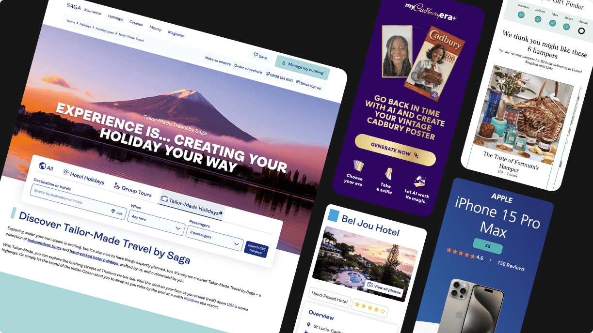
Collage of examples of our accessible and inclusive design work
Accessibility and inclusive design is baked into everything we create
Everything we create has accessibility and inclusive design baked in, and some projects require dedicated effort to make sure that the experience is open to all. Here are a few examples:
- Creating an accessible egg hiding experience within Google Maps for Cadbury Worldwide Hide: including screen-reader support, tab indexes throughout and a full set of keyboard shortcuts within the map experience – allowing users to hide or find their egg without ever using a mouse.
- Designing a fully accessible redesign of Saga.co.uk: Extensive considerations such as ability to magnify text without breaking the components, strong colour contrast throughout and ensuring touch-friendly button sizes – were made to ensure that the redesign of the Holidays and Cruises sections, underpinned by our new Design System, was an inclusive and user-friendly experience, especially for their older target audience.
- Making everyone feel included within My Cadbury Era: Working with a leading LGBTQ+ charity, members of Mondelẽz International’s diversity and inclusion network and of the VCCP DE&I Collective to ensure this activation was as inclusive as possible – especially of skin tone and gender options.
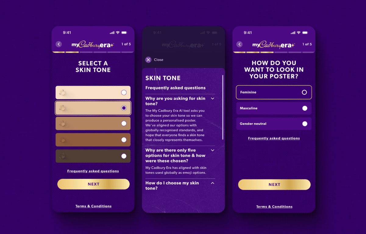
Inclusive skin tone and appearance options within the My Cadbury Era website
How do we do accessible and inclusive design?
These topics can sound great, but it’s often difficult to understand what it means, partially, to apply to day-to-day work.
Firstly, accessible web design is all about ensuring that everything we create adheres to WCAG standards. Ok cool, but what does that really mean? We’ve made our lives simpler, and instead of asking everyone in our team to know the WCAG website inside out, we’ve created an Accessible Design and Content Checklist – so that we can easily follow the 40 design and content specific guidelines.
Secondly, inclusive design is less straightforward, because there are no specific guidelines to follow or criteria to adhere to. Instead it’s about including people from your target audience within your process. For example, for My Cadbury Era when deciding on what gender options to offer, we worked with people in the LGBTQ+ community to make the best design decisions. Inclusive Design is about doing everything you can to include relevant people in your design process, so that the ultimate design output is as inclusive as possible for the people using it.
Thirdly, we test our designs with both people who have accessibility needs, and with people from a range of backgrounds and cultural groups – so that we find out whether a wide range of people can both use your experience effectively, and find out whether they feel included at the same time.
Finally, the most important thing that we do at Bernadette, is advocate for and evangelise the practice of accessible and inclusive design throughout the process – we educate people on why it’s important, and create content and run activities to help people empathise with those who have accessibility needs, or are experiencing exclusion. This way people feel passionate about making good design decisions, and view it as a positive element of their work, rather than resist it.
3 free downloads
We’ve created a few documents to make it easier to start your journey into accessible and inclusive design – please help yourself and feel free to share!
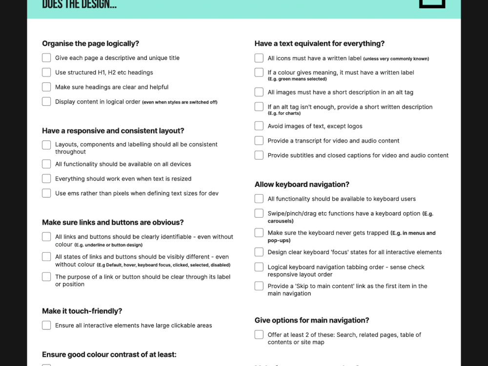
Accessible Design & Content Checklist
Reading the detailed accessibility criteria documentation is a big undertaking for anyone starting out, so we pulled out 40 criteria that are relevant to UX Designers, UI Designers, Copywriters, Video editors and Content Managers.
We’ve written the checklist in simple English, so that it’s super easy to understand. Just a note that it doesn’t cover technical criteria, please refer to WCAG guidance for these.
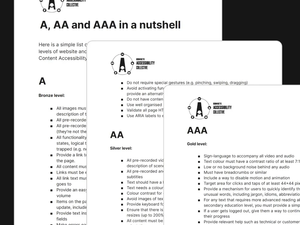
A, AA & AAA in a Nutshell
The WCAG accessibility criteria (that’s short for ‘Web Content Accessibility Guidelines’) are essential to understand, as laws around the world reference these. However, they can be overwhelming. Here’s a simple cheatsheet to get you started.
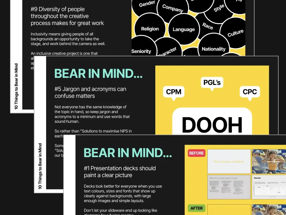
10 Things to Bear in Mind when creating Inclusive Designs
To make things a little easier for you to get started, or continue on your journey to delivering accessible and inclusive design, we’ve put together a set of pointers for you to ‘Bear in mind’ when creating design work.
Meet our Accessibility Collective

In 2020, we established the Accessibility Collective at Bernadette - a cross-discipline team that advocates, upskills and delivers accessibility for all our clients. We have 5 objectives:
Watch our introduction video by Steph Marques, our Head of UX who leads our Accessibility Collective and also sits on the BIMA Inclusive Design Council. Steph’s work in this area has transformed brand-customer relationships through many brands’ digital experiences and she has been recognised with the Oystercatchers ‘Champion for Change’ award.
Accessibility Isn’t Optional — It’s Just Good Design
Accessibility Isn’t Optional — It’s Just Good Design
A Bernadette Perspective on Inclusive Digital Experiences
Whenever Global Accessibility Awareness Day rolls around, we see it less as a reminder — and more as an opportunity. A chance to bring a conversation into the spotlight that, for us, never really stops. It’s a chance to pause, reflect, and re-centre the conversation—not just around compliance or code, but around creativity. Because here’s the thing: accessibility requirements aren’t chores to be grudgingly addressed. They’re often missed opportunities within the design space hiding in plain sight. Yet somehow, certain myths persist.
Chief among them is this old chestnut: “Accessibility is just a checkbox to meet legal requirements.” Except it’s not. We understand that accessibility isn’t fringe—it’s mainstream. One in five people in the UK has a disability. That’s not a niche audience. That’s over 14 million potential customers(1) and a huge slice of your core audience.
It’s the world, as it is—not as it’s been narrowly designed for by a legacy design culture that centres convenience over inclusion, aesthetics over access, and assumes usability for one means usability for all.
When we dismiss accessibility as a legal hoop to jump through, we don’t just let people down — we shut them out entirely. And in doing so, we limit what design can be: not a tool for connection, but a barrier to entry.
We also lower our own creative ceiling. We cut off routes to better UX, smarter content, sharper design. At Bernadette, we believe accessible design isn’t about compromise. It’s about making things better, for more people, in more situations.
So this Global Accessibility Awareness Day, we’re dispelling the myths, rethinking the defaults — and pointing the way toward building digital experiences that actually work for everyone.
Visual Accessibility – It’s Not Just About Screen Readers
Another persistent myth is that “accessibility is simply for people with poor vision”. It’s true that when some people think of accessibility, they might very well think of screen readers, text size and contrast. And that’s about it. Vision in the narrowest sense of the word.
But here’s the truth: visual accessibility isn’t just about blindness. It spans everything from colour blindness to cataracts, partial sight to temporary eye strain — and even environmental factors like bright sunlight, glare, or tricky viewing angles in a moving car. It’s about making sure people can actually see, scan, and understand what you’ve put in front of them — regardless of how perfect their eyesight is (or isn’t) at that time, or where they happen to be.
2,250 out of every 50,000 website visitors have a colour vision deficiency(2). So, what does good visual accessibility look like?
- It looks like high-contrast colour combinations that work in bright sunlight and for users with red–green colour blindness.
- It looks like text that scales smoothly without shattering the layout.
- It looks like image alt tags that describe rather than apologise.
- It looks like a site that holds up under a magnifier, on a projector, on a cracked phone screen.
A smarter way to think about these applications is that it isn’t just altruism. Rather, it’s smart digital hygiene. Better contrast is better SEO. Clearer structure is lower bounce rates. Scalable, readable content is a broader audience who sticks around longer.
When you build with sight in mind—all types of sight—you’re not muddying the picture or diluting the design, you’re sharpening it. This is a clearer lens through which to look at the visual aspects of accessibility design. It’s about having an eye for the different kinds of visual constraints that need to be catered for in order to make your content not just visible, but visible to everyone.
Hearing Accessibility – Design that speaks volumes even on mute
A user’s ability to hear—whether affected by a hearing impairment or a noisy environment—is a crucial factor in accessibility design. And yet, the myth persists: “As long as we’ve got audio, we’re covered.” This assumes that rich, well-produced audio —podcasts, voiceovers, sound cues, music—is enough. That if it sounds good, it is good. But that’s only true if everyone can actually hear it.
The reality? Many users are deaf or hard of hearing. Others process information visually, or are simply in environments where sound isn’t an option — like packed train carriages, busy offices, or the middle of the night with a baby asleep next to them. In fact, 75% of social media videos are watched on mute(3) — meaning if your content depends on audio to make sense, it’s already missing most of your audience.
And if your content doesn’t include captions, transcripts, or visual equivalents of those audio cues? It might be beautifully produced—but it’s effectively silent. Simply put, if your content only works with sound, it doesn’t fully work as well as it could.
So what does better sound accessibility actually look like?
- It means adding subtitles to every video, not just the polished campaigns.
- It means including transcripts for audio—interviews, podcasts, explainers—so users can scan, quote, revisit.
- It means designing in clear visual prompts for sounds — whether that’s a persistent alert, a soft visual cue, or a notification that’s easy to spot without relying on audio alone.
- And where possible, offering alternative formats—from written recaps to text-based customer service chats.
These fixes are simple, scalable, and highly effective. They improve comprehension, increase engagement by opening the door to millions more users. And when these accessibility components are done well, it ensures that brand communications still ring true —even when the sound is turned all the way down.
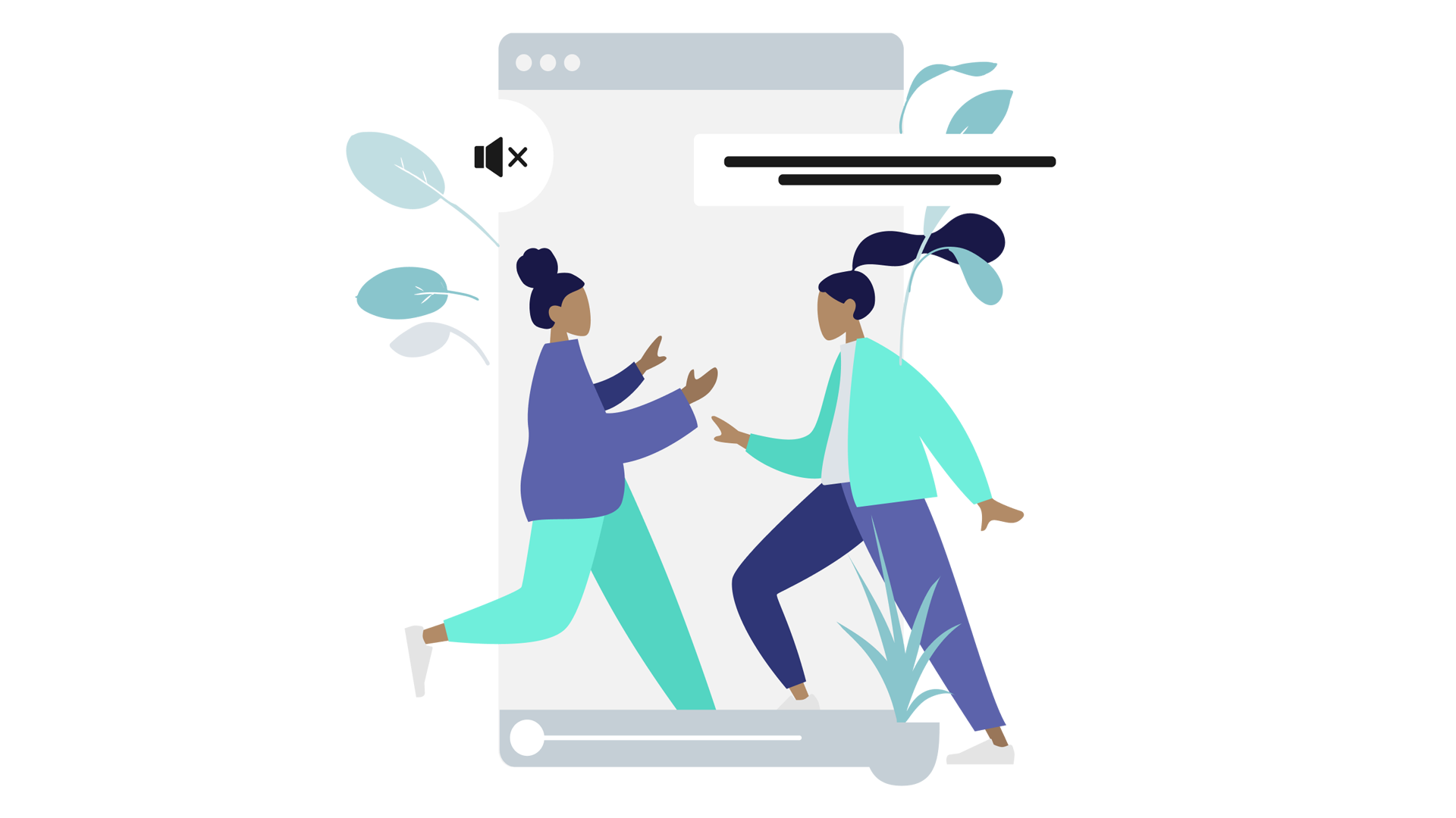
Touch & Motor Accessibility – It’s Not All Point and Click
Here’s a myth that quietly creeps into design decisions all the time: “Everyone uses tech the same way.” Click the button. Swipe the screen. Tap to confirm. Easy, right?
Well, that depends. This kind of thinking assumes every user has full dexterity, steady hands, and the physical ease to interact with digital devices exactly as intended.
But that’s not reality.
Many people live with motor impairments that affect how they use tech—from Parkinson’s and cerebral palsy to arthritis, MS, or temporary injuries. In the UK, mobility is the most frequently reported impairment—affecting 48% of disabled individuals(4). Some cannot use a mouse, while others rely entirely on keyboard navigation, voice commands, or adaptive hardware to get around a screen.
When forms are fiddly, buttons too small, or interactions rely on complex gestures, the experience becomes frustrating — or flat-out inaccessible. And the cost is real: 72% of users have abandoned a purchase because of poor accessibility(5).
So what does accessible interaction design look like?
- It looks like clearly labelled, easy-to-reach buttons that don’t require pixel-perfect precision.
- It looks like keyboard-friendly navigation that moves smoothly through forms, menus, and buttons — without needing a mouse.
- It looks like reduced motion requirements, with no need for swiping, dragging, or two-fingered anything.
- It looks like input fields that don’t time out mid-entry — especially when typing takes longer.
These aren’t fancy extras. They’re design basics that widen access, boost usability, and remove needless friction for everyone—including someone tapping with a thumb on a bumpy train. Because when digital design assumes a single way of interacting, it doesn’t just fail some people—it shrinks your entire audience.
Language, Literacy & Speech – If They Can’t Read It, They Can’t Buy It
Another myth that quietly shapes digital projects is the assumption that general audiences are fully up-to-speed with technical concepts and possess flawless reading comprehension: the idea that “our audience is tech-savvy and hyper literate.”
Low literacy rates, second-language speakers, and users with learning difficulties are everywhere—in fact, 8,200 out of every 50,000 site visitors in the UK have low literacy7. But there’s no neat metric that tells you why someone gave up — whether it was a wall of jargon, a confusing instruction, or a checkout flow that left them second-guessing their next step.
Accessibility here isn’t just about who can technically click through your experience. It’s about who feels confident doing it. This demands a clear and considered approach to UX copywriting—optimising language to perform across a wide and varied reading audience.
So what does better look like?
- Simplicity: Use short, direct sentences with everyday words—without sacrificing meaning or tone.
- Consistency: Stick to familiar terms and patterns across all pages to reduce cognitive load.
- Clarity: Prioritise instructions, CTAs, and key messages visually and verbally—no burying the lead.
- Supportiveness: Provide context when needed (tooltips, prompts, hints) so users aren’t left guessing.
Because accessible language doesn’t mean dumbing things down—it means opening things up. Making every message easier to follow, every action simpler to take, every user more confident in what they’re doing. It’s about writing in a way that works for everyone—just like this.
Neurodivergent Accessibility – Creativity Needs Room to Think
Neurodivergent people—including those with ADHD, autism, dyslexia, and more—engage with digital spaces in ways that aren’t always linear or predictable. It’s easy to assume that catering for such a broad and complex range of needs would inevitably compromise good design—giving rise to the myth that “accessibility limits creativity.”
But this idea—that designing for inclusion somehow strips away the artistry…flattening digital experiences into something plain and predictable. But that’s not how creativity works — and it’s not how we design.
When you actually listen to what neurodivergent users need—clarity of structure, consistency of patterns, freedom from cognitive overload, and the ability to control distractions like autoplay videos, flickering animations, and chaotic layouts—it doesn’t stifle creativity.
With only 31% of autistic adults in the UK currently in employment(6), the stakes are real and there’s a demand for designers to find smarter, sharper solutions that ultimately benefit a broader share of your audience.
This is where neuro-inclusive design principles come into their own, reinforcing fundamentals such as:
- Clean, intuitive layouts where content flows logically.
- Error-tolerant forms that forgive mistypes and missed clicks.
- The ability to pause, control, or disable movement and animation.
- Simple, direct language that respects attention rather than assuming it.
The best digital spaces aren’t built for a mythical “average user.” And, just like the most iconic design principles in history have taught us—when you design for difference, you often end up making something better for everyone.
The Big Myth — Why Accessibility Isn’t Optional (or Boring)
At the root of a lot of digital inertia is this over-arching, self-defeating myth: “Accessibility is expensive, boring, and not my problem.”
It’s this kind of thinking that frames accessibility as an optional extra—a nice-to-have if there’s budget left over, or a grudging compliance exercise when there isn’t.
At Bernadette, we’re focused on turning this perception on its head, and reframing accessibility as a welcome safeguard, a growth strategy, and a creative unlock—all rolled into one. And, when it comes to cost, you can take our word for it… It’s far cheaper (and far less painful) to design accessibly from the outset than it is to retrofit it later. That’s because 71% of users with disabilities will immediately abandon a site that isn’t accessible, costing UK businesses an estimated £17.1 billion annually in lost revenue(8).
And the idea that accessible design is boring? Well, a good sense of imagination and an inspired approach to solving problems explodes this final myth like a firecracker in a quiet room. Sure, leave accessibility in the hands of the uninspired, and yes—you might get a bit of dull, box-ticking work that doesn’t really know what it’s doing. (Spoiler: we know what we’re doing.)
Truthfully, we don’t think accessibility should be anyone’s ‘problem.’ Rather, it should be approached as a solution and an opportunity to push design in digital experience further.
So… Why Work With Bernadette?
Got a business challenge that’s looking for an innovative digital solution? Or, perhaps you’re interested in joining our collective of digital pioneers? Maybe you just want to know a little more about what we do. In any case, we’d love to hear from you.
Ready to See How Your Site Actually Performs?
Want to know how your digital experience stacks up—not just for ‘ideal’ users, but for real people, in the real world? Let’s find out.
Book an accessibility audit with Bernadette. We’ll show you where the barriers are, where the opportunities lie, and how a few smart changes could open up your brand to a much wider audience.
Just honest, practical insight—and a clear path to making your digital spaces stronger, sharper, and more inclusive.
- https://wearepurple.org.uk/understanding-the-purple-pound-market/
- https://www.colourblindawareness.org/colour-blindness/
- https://digiday.com/sponsored/75-percent-of-people-watch-mobile-videos-on-mute/
- https://researchbriefings.files.parliament.uk/documents/CBP-9602/CBP-9602.pdf
- https://wearepurple.org.uk/understanding-the-purple-pound-market/
- https://www.gov.uk/government/news/employment-prospects-for-neurodiverse-people-set-to-be-boosted-with-launch-of-new-expert-panel
- https://literacytrust.org.uk/parents-and-families/adult-literacy/
- https://clickawaypound.com/downloads/
Why The Future of Brand Lives in Digital
Why The Future of Brand Lives in Digital
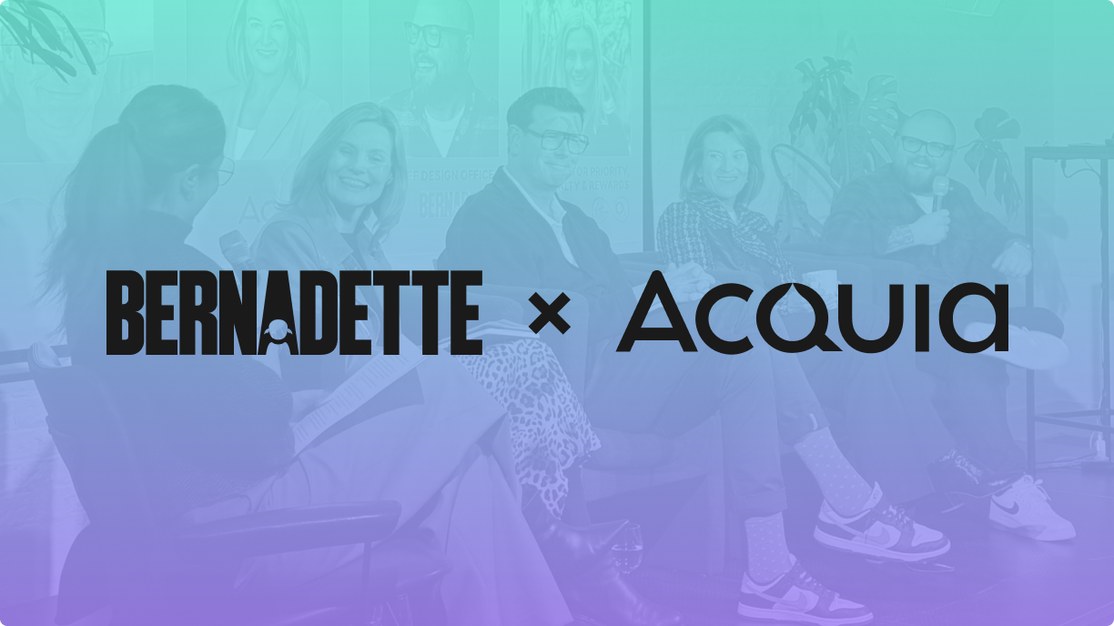
Our recent event, in partnership with leading cloud platform Acquia, centred on a simple but powerful question: can digital experience drive customer and brand value?
If the conversation on the night was anything to go by, the answer is a clear yes. There was strong alignment across the panel, which brought together digital thought leaders Simon Manchipp, Jennifer Griffin Smith, and our own Chief Creative Officer Jonny Goodall.
What emerged was a shared recognition that, in a world of shrinking attention spans and rising expectations, brands need more than a polished interface.
Logos, colours, and fonts? That’s just 13% of what makes a brand memorable.
Simon Manchipp - Founder of SomeOne
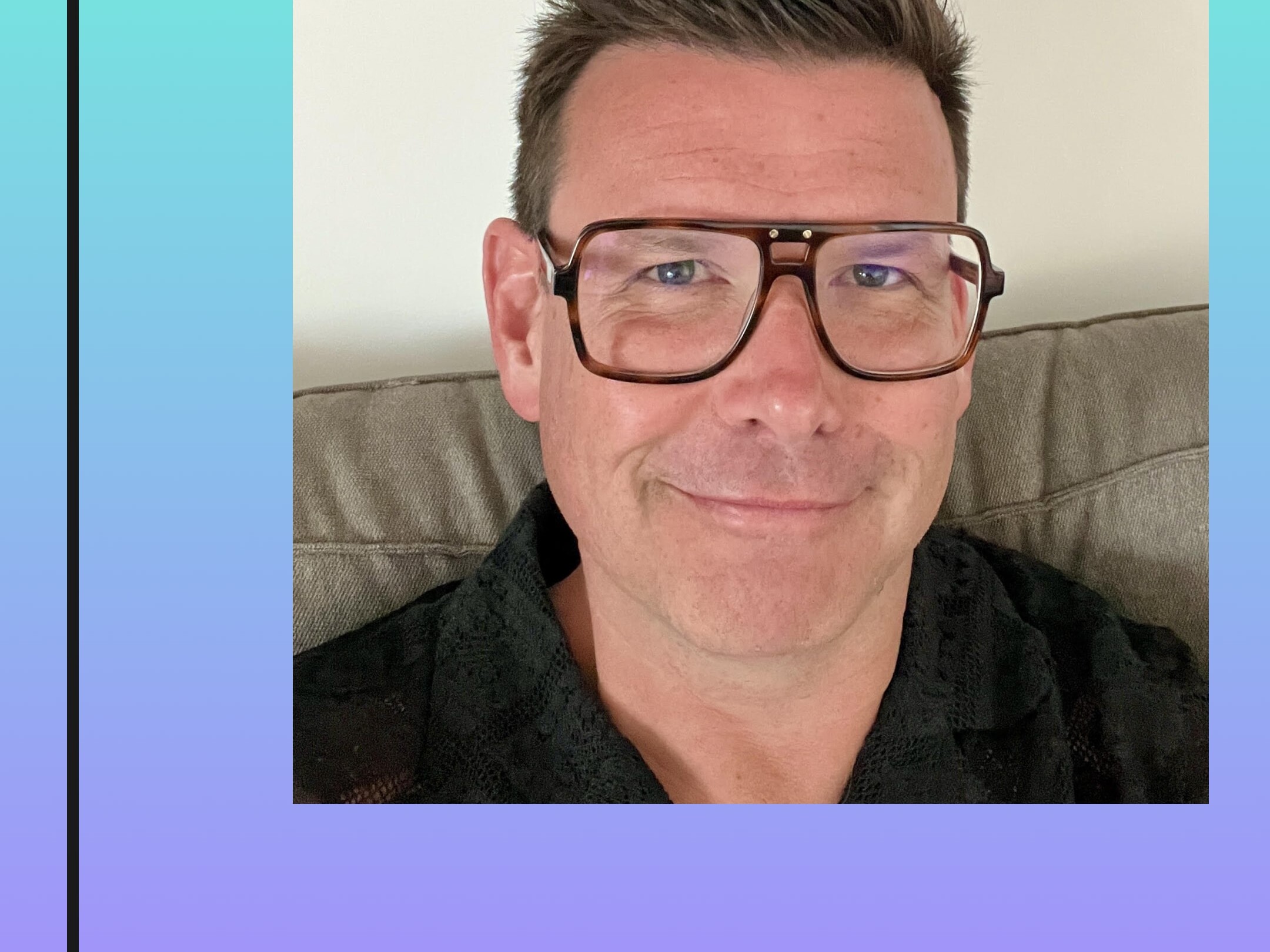
As Simon pointed out, brand does not live in logos or surface elements alone. Instead, the best brands build around big ideas. defining concepts that shape storytelling and digital interactions. From Pixar’s Plussing philosophy (always adding, never stripping down) to Compare the Market’s meerkats, the strongest digital experiences don’t just function. They entertain, engage, and evolve.
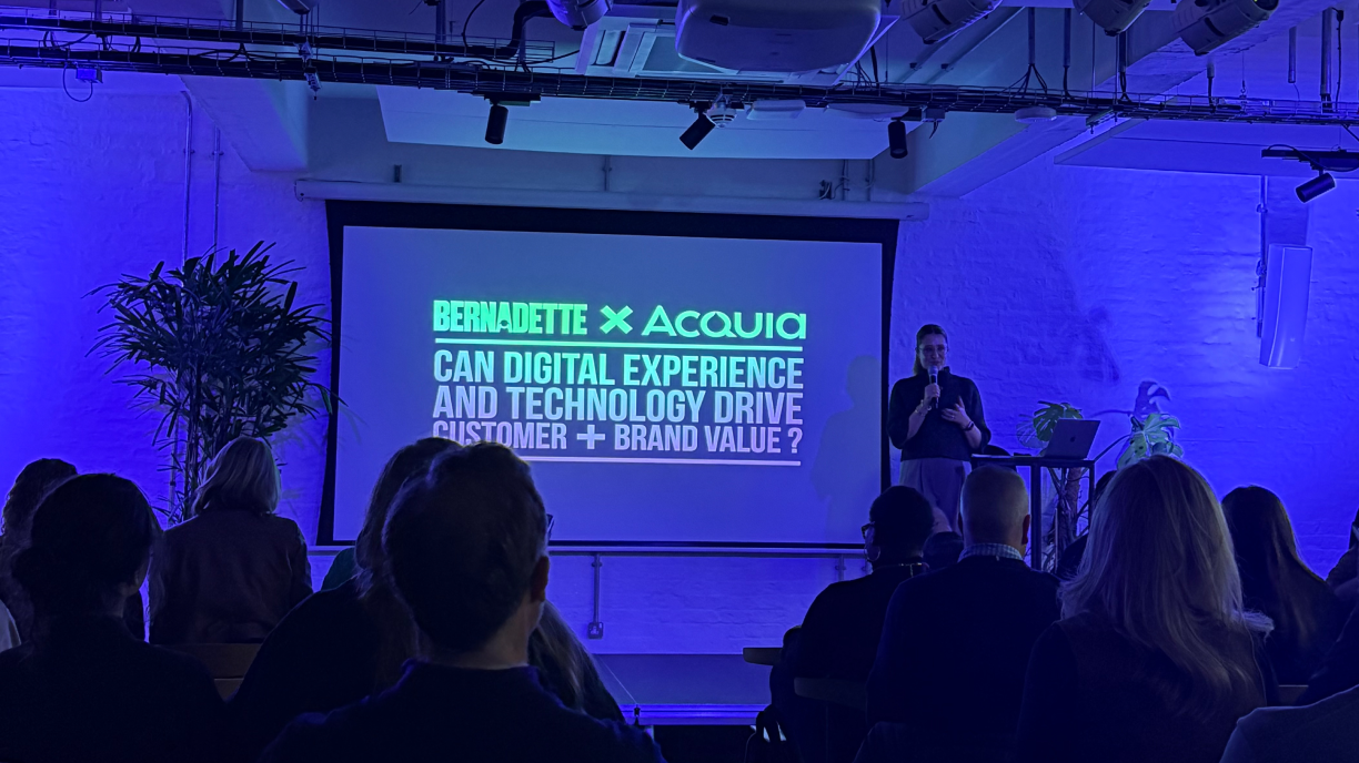
Branding isn’t just about visuals—it’s about trust, and nothing erodes trust faster than a broken digital experience
Jennifer Griffin Smith - Chief Marketing Officer, Acquia

Jennifer’s insights only served to reinforce Simon’s thinking – because big ideas in digital are so often dependent on the sophistication of systems beneath the surface.
Cohesion across those systems, she argued, is what truly matters. Even great creative ideas can hit hurdles when journeys are fragmented or inaccessible. When they’re seamless, intuitive and intelligently connected, value builds. Jennifer went on to highlight how brands like British Airways lose customers through clunky, disjointed systems, while Tesla wins by making car buying seamless and digital-first.
The takeaway? Digital experience is brand perception. Get it right, and customers stay. Get it wrong, and they leave without a word.
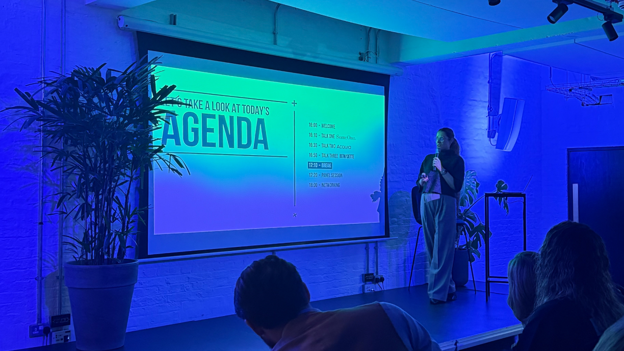
In a world of digital amnesia, forgettable brands don’t stand a chance
Jonny Goodall - Chief Design Officer, Bernadette

Jonny extended this thinking into practice, calling for a cultural shift in how integrated platforms and services are used to place greater emphasis on quality of experience. He went on to explain the profound implications from a design perspective – a pivot away from ‘minimum viable thinking’ towards inviting challenge and – through iteration and experimentatio – adopting more elevated, exploratory design approaches from the outset.
Proof of this new kind of thinking is, he argued, is evident all around us – demonstrated by a surplus of websites and apps that look uniformly templated, soulless, and easily ignored.
In short, function alone won’t cut it. Experience is everything.
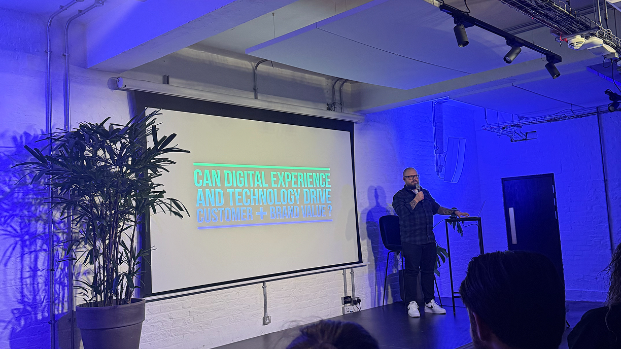
Under discussion: The New Rules of Digital Experience
To close the evening, Bernadette’s Chief Strategy Officer, Iva Johan, hosted a live panel featuring all our speakers. They were joined on stage by Lisa Johnstone, Director of Priority, Loyalty & Rewards at Virgin Media O2, who brought a sharp perspective from the client side – diving deeper into the intersection of brand, technology, and customer experience.
Lisa’s message was clear: digital isn’t just a tool, it’s a test that brands either pass or fail based on how well they listen. From tackling fraud with AI to balancing scale with humanity – she championed trust, cultural relevance, and omni-channel cohesion as the real currencies of loyalty.
Curious how the whole conversation played out? You can check out the full video below.

Brand Mascots to Digital Twins
Brand Mascots to Digital Twins - Production amplification and acceleration
Jon Bancroft – Bernadette’s Head of 3D and Motion, and Jonny Goodall, Chief Design Officer talked to The Drum about the wonders of the game engine Unreal, as a tool for creating reusable, flexible, one source of truth assets for brands – Creating digital twins of mascots and products.
Read more here
Bernadette X BIMA Inclusive Design Council.
Bernadette X BIMA Inclusive Design Council.
The Bernadette team, Steph Marques, Matthew Brady & Philip Beaman were interviewed by Becky Ferraro & Amina Aweis from the BIMA Inclusive Design Council.
They discussed Cadbury Design Systems, Accessibility and My Cadbury Era – the winner of The Inclusive Design Award at the 2024 BIMA Awards which was recognised for its innovative approach to Gen-AI powered experiences.
Watch the full interview now: https://lnkd.in/gKRUYYP2
hosted on: BIMA website and on the BIMA YouTube channel

Character Building
Character Building
Recently we launched Animals and Objects - An ongoing collection and celebration of all the wonderful 3D characters and workflows around getting the best out of assets across a brand digital ecosystem. Read more here.
Part of the process to make our 3D models work, is not only 3D and motion production but also the asset and character ideation and design. But the character development can take a while to get right – no matter what it is – an object, a robot, a person, an animal. Finding the right style, mood, era, genre can be slow and stall the production process.
So, as part of our exploration beyond creating rigs and meshes or digital twins and motion systems for all the animals and objects we make – we thought it only right to look at the exciting possibilities of the generative Ai tools out there – In the hope that this could accelerate ideation, character development and production proof of concepts too.
We’ve been using a ComfyUI workflow powered by stableDiffison to generate images of Meerkats, Wombat, Goats, Cats, Dogs, Zombies, Kid, Adults etc in a variety of styles to see what works that help designers build what we need.
Then using Kling to bring some of those characters to life through text-to-motion promotes.
We then took these animatics and used them as part of storyboarding, to help guide narrative.
Here is a little teaser reel of what we’ve done.
And check out the gallery below to see the characters in all their glory.





And check out what we collaborated on with our friends at fAIth and Girl&Bear recently here.
More exciting AI and 3D developments coming soon

Unlocking the full potential of your brand world in the Digital Age.
Unlocking the full potential of your brand world in the Digital Age.

We are proud to announce the launch of Bernadettes Animals and Objects - a collection and a celebration of the power of progressive production techniques to unlock the full potential of a brand assets across your digital ecosystem.
Building on the core principles of UI systems and design at scale – using new techniques and tools like Unreal engine, and AI Mo Cap to just name a couple. We have been making reusable 3D character rigs and motion systems that clients can use in-house, or the wider VCCP Group can use across integrated brand and campaign world rollouts: Whether it be in Comms Production with Girl & Bear, or for Training Ai in Faith, or using them directly in Bernadette for standalone interactive and immersive experiences like games and AR or in small micro moments in core user journeys.
We look at how these assets can be made flexible and reusable, and systemised – to help simplify production pipelines. Upholding consistency – without losing personality and appeal. Making sure to get the best out of the asset wherever you see or experience the brand.
From photo realistic animals, to loveable blue robots, we can now provide flexible digital twins usable in channel-first creative ideas, and large scale campaign production solutions – future proofing brands for the modern digital age.

Don't think harder, think smarter: Bringing Design and Systems Thinking together
Don't think harder, think smarter: Bringing Design and Systems Thinking together
We see them every day; stories of failed start-ups, digital transformation flops and customer experience fails - successful digital products are incredibly hard to achieve.
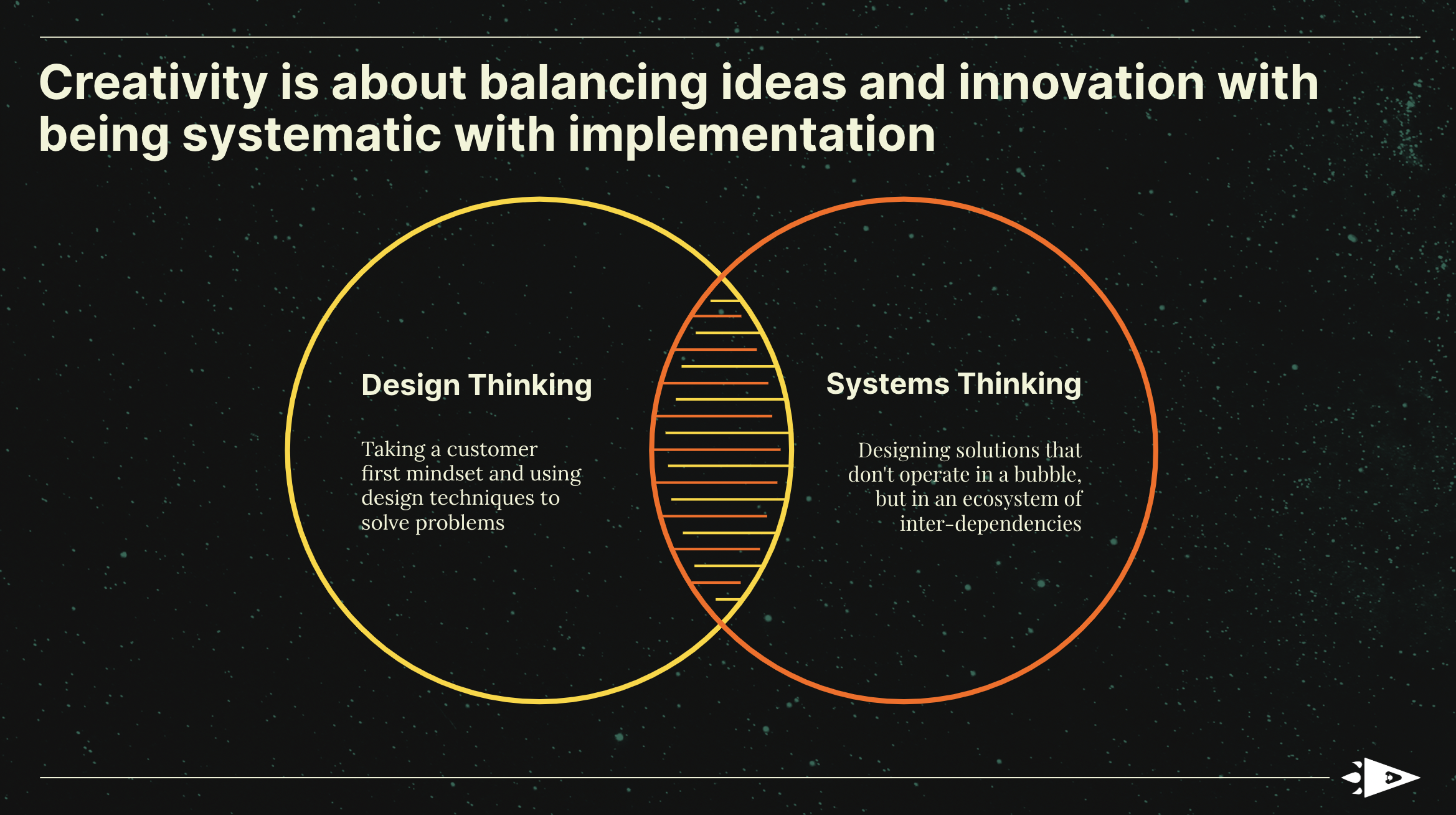
Iva Johan, Chief Strategy Officer, and Steph Marques, Head of UX have been featured in Creative Salon Worldwide, and believe they understand one of the reasons why.
They believe “All too often design and product led teams are over indexing in their Design Thinking approaches to solving problems, and at the other end of the spectrum, operations and business led teams are leaning too heavily into a Systems Thinking approach.”
When working with Cadbury on reimagining their website, combining the two thinking styles allowed us to take our original brief from what was a simple website redesign, to unlocking real opportunities by defining a new purpose for the website in the wider ecosystem.
In the case of our work with Italy specialist Citalia it’s been important to think of their business as a system, to make sure that the optimization work we do is feeding into what the business is trying to achieve.
We have a duty to mix both ways of thinking in order to give the products and services we create the greatest chance of being successful.
Read the article in full here: Don’t Think Harder, Think Smarter: Bringing Design And Systems Thinking Together
Problem Solved: How Fortnum & Mason helped shoppers to find the perfect hamper for their loved ones
Problem Solved: How Fortnum & Mason helped shoppers to find the perfect hamper for their loved ones
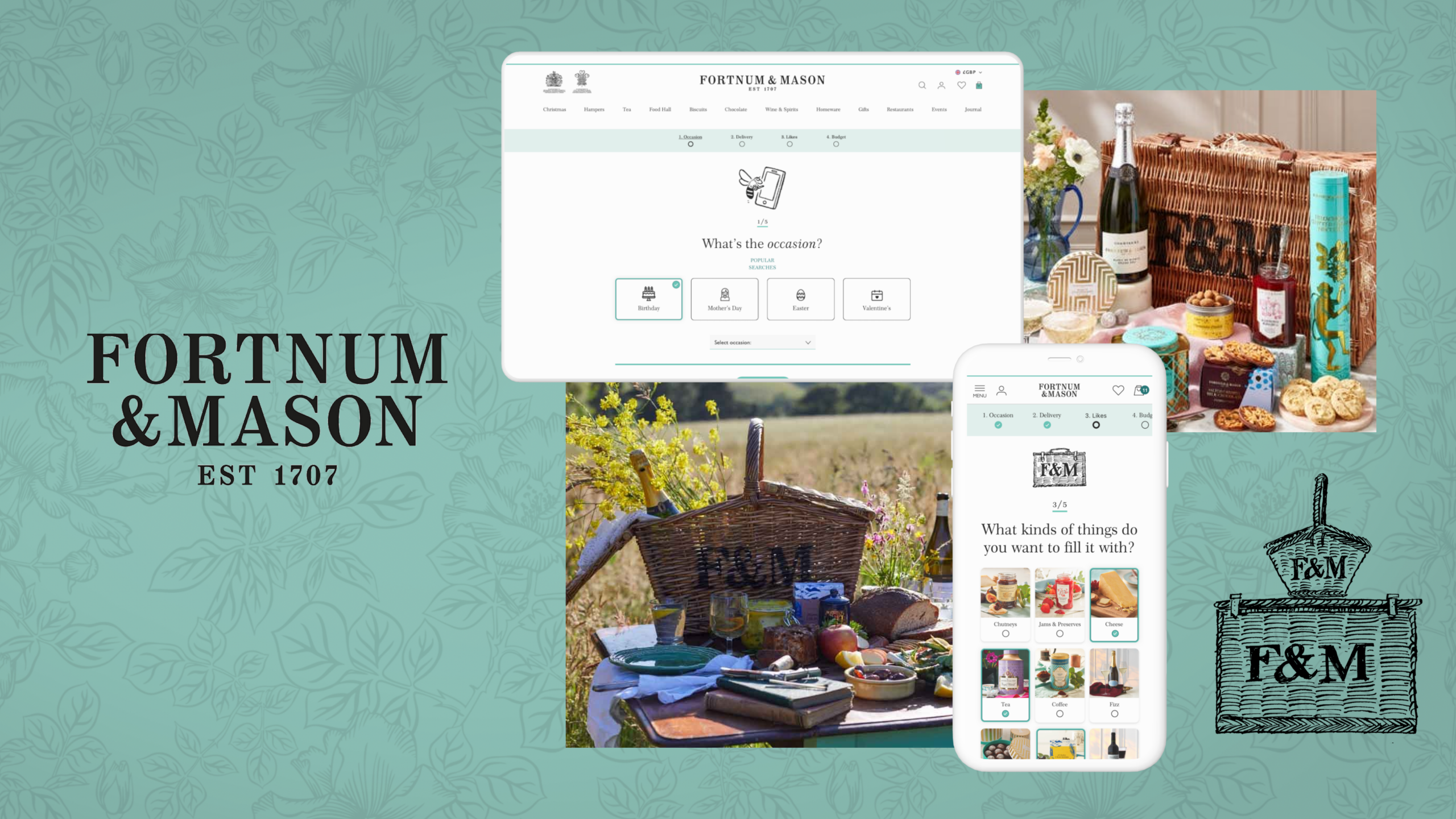
Desktop and mobile screens showing the online hamper finder tool on the Fortnum & Mason website alongside photos of the iconic wicker hampers with food and drink inside them
Our Head of UX, Steph Marques, and Creative Director, Will Aslett, talk us through how their team helped Fortnum & Mason to match shoppers with their perfect hamper, with the iconic ‘Hamper Finder.’
Our methodical approach and collaboration with Fortnum & Mason goes on to promote the power of creativity and technology in elevating online experiences.
Read the full story in LBBonline – Little Black Book by clicking the link below:
Problem Solved: How Fortnum & Mason Helped Shoppers to Find the Perfect Hamper for Their Loved Ones

Bear in mind…ways to create accessible and inclusive designs
Bear in mind…ways to create accessible and inclusive designs

Global Accessibility Awareness Day is celebrated in May each year, and is an important date in the diary celebrated by our Accessibility Collective. Well, today is the day and this year we’re bringing to you some things to ‘Bear in mind’, so as to help guide you in creating more accessible and inclusive designs.
Design is hugely wide-ranging, from website and apps, to communications design from social posts and print adverts, to presentation decks and emails — and of course much beyond this too.
But what does ‘accessible and inclusive design’ actually mean?
Accessibility is all about giving people the ability to access information and services by allowing them to better use and understand a design. You may be forgiven for thinking this principle applies simply to people with certain disabilities — which it does — but in reality accessible design benefits everyone. Afterall, no one likes yellow text on a white background right?
Inclusive design is even broader, and is all about making sure that no one feels excluded, perhaps by the language or images used, or the form fields available for gender selection, as examples.
So, to make things a little easier for you to get started, or continue on your journey to deliver accessible and inclusive design, we’ve put together a set of pointers for you to ‘Bear in mind’ when creating design work…
Bear in mind...
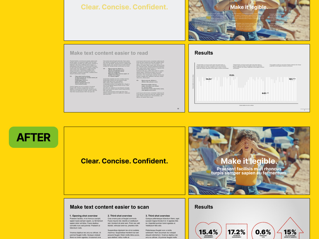
Presentation decks should paint a clear picture
Decks look better for everyone when you use text colours, sizes and fonts that show up clearly against backgrounds, with large enough images and simple layouts.
Don’t let your slideware end up looking like diagrams for a fusion reactor.
Bear in mind...
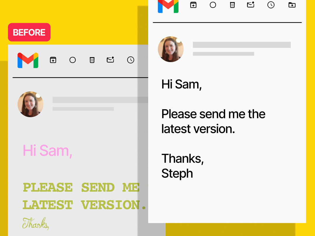
Well-formatted emails are easier to digest
Use legible text sizes - typically 12pt or above, standard sans serif fonts and underlined links.
Also, let’s avoid using poorly contrasting colours, and UPPERCASE BECAUSE IT LOOKS LIKE YOU’RE SHOUTING ARGHH!!!
Bear in mind...
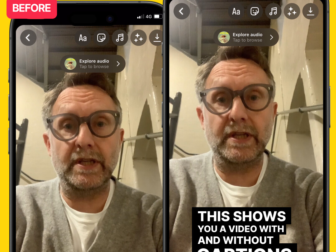
Some people can't hear the sound
When posting a video, make an effort to provide an option for closed captions or subtitles.
If you’re creating a video with a voiceover, try to make sure your music cues don’t interfere or distract from the spoken word.
Bear in mind...
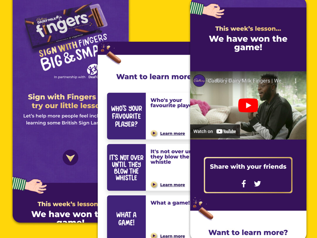
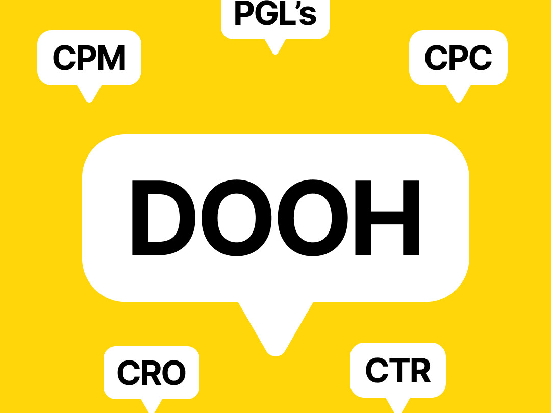
Jargon and acronyms can confuse matters
Not everyone has the same knowledge of the topic in hand, so keep jargon and acronyms to a minimum and use words that sound human.
So rather than "Solutions to maximise NPS in each vertical.”
Someone may better understand... “Solutions to improve how people feel about our brand in each industry.”
Bear in mind...
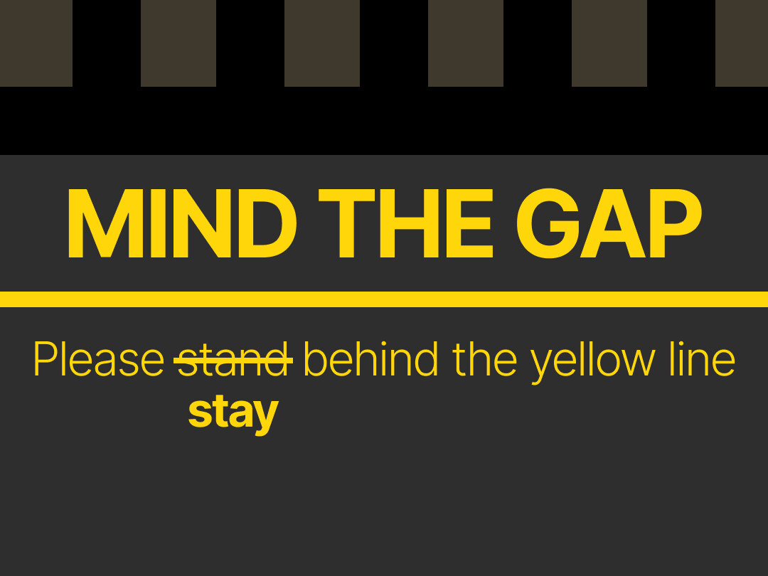
Websites and apps need to work for everyone
Designing a website? Try to ensure ALL your visitors can interact with the content — by keeping things simple, ensuring good colour contrast, removing obstructions, and optimising navigation.
Making sure websites and apps are accessible is the right thing to do, and is soon to be a legal obligation.
Bear in mind...
Using empathetic language makes everyone feel included
Know your audience. That means being mindful of the people you’re talking to and shaping your language to accommodate their lived experiences.
This approach helps us become more naturally empathetic while avoiding non-inclusive and hurtful phrases.
Bear in mind...
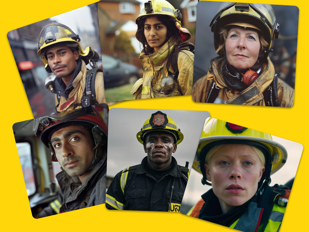
Avoid giving into stereotypical representations of people
Stereotyping of people exists for a variety of reasons — all of us exercise degrees of unconscious bias.
Being aware of this, let’s challenge problematic stereotypical thinking in a way that’s sensitive, respectful and without judgement.
Bear in mind...
Involving your audience can help create authentic representation
By giving your target audience early involvement in the research and development process, you’ll be able to give them more effective representation.
If people from your audience are hard to find, we recommend working closely with relevant organisations, whether it’s our DE&I Collective, RNIB, Stonewall, or another that supports marginalised groups.
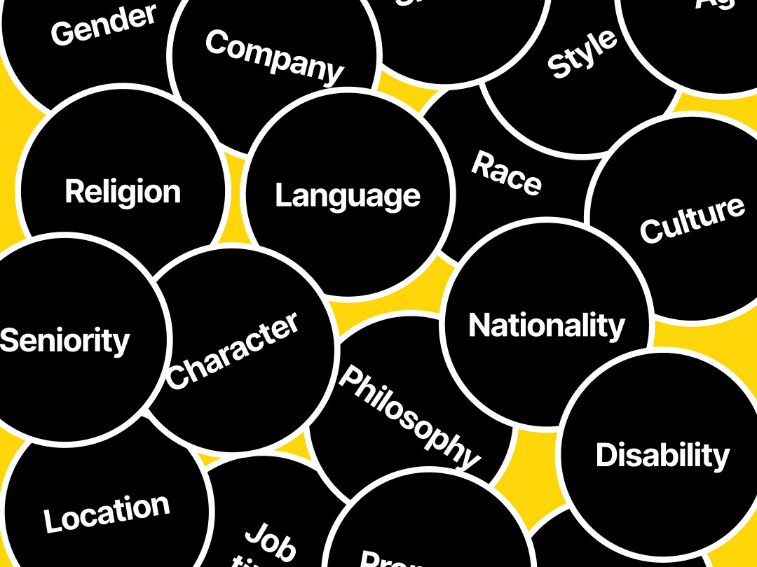
Bear in mind...
Diversity of people throughout the creative process makes for great work
Inclusivity means giving people of all backgrounds an opportunity to take the stage — and work behind the scenes as well.
An inclusive creative project is one that allows everyone to write, manage, direct, engineer, or appear in, regardless of gender orientation, ethnicity or culture. Keep this in mind when recruiting your team.
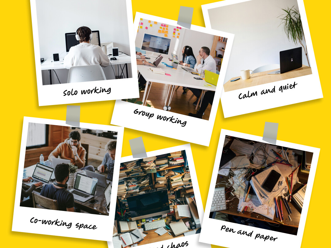
Bear in mind...
We don’t all work the same way
People like to take different approaches to reaching the same creative output.
Some people like big meetings, others like one-to-ones, some like flexibility while others like structure.
Let’s try to communicate so we understand each other's needs.
We hope these pointers help you to make improvements to how you approach design going forwards, and if you’re ever not sure the best approach, just ask for help – that’s what inclusive design is all about.
Enjoy!
Bernadette Accessibility Collective x VCCP DE&I Collective x Girl&Bear