Saga
Holidays & Cruises websites
Helping Saga to rejuvenate their travel offering with a brand new approach to ecommerce
The Challenge
Saga offers an expansive array of travel experiences, encompassing over 100 countries and islands worldwide, ranging from tranquil hotel stays to exhilarating cruises.
However, Saga had been struggling with new customer acquisition, and needed help to overhaul their image, to appeal to a younger audience.
We were tasked to completely redesign the look and feel of the Saga website – to freshen and modernise its appearance. Coupled with new product offerings – designed to give a younger audience more independence and flexibility – we aimed to bring a whole new demographic of customers on board.
Alongside the branding challenge, we needed to seamlessly integrate the recently introduced holiday products into the website, to coexist alongside the established Holidays and Cruises offerings. We needed to create intuitive pathways for users to explore and book these new holidays, ultimately contributing towards Saga’s vision of becoming the premier travel destination for their target demographic.
The Solution
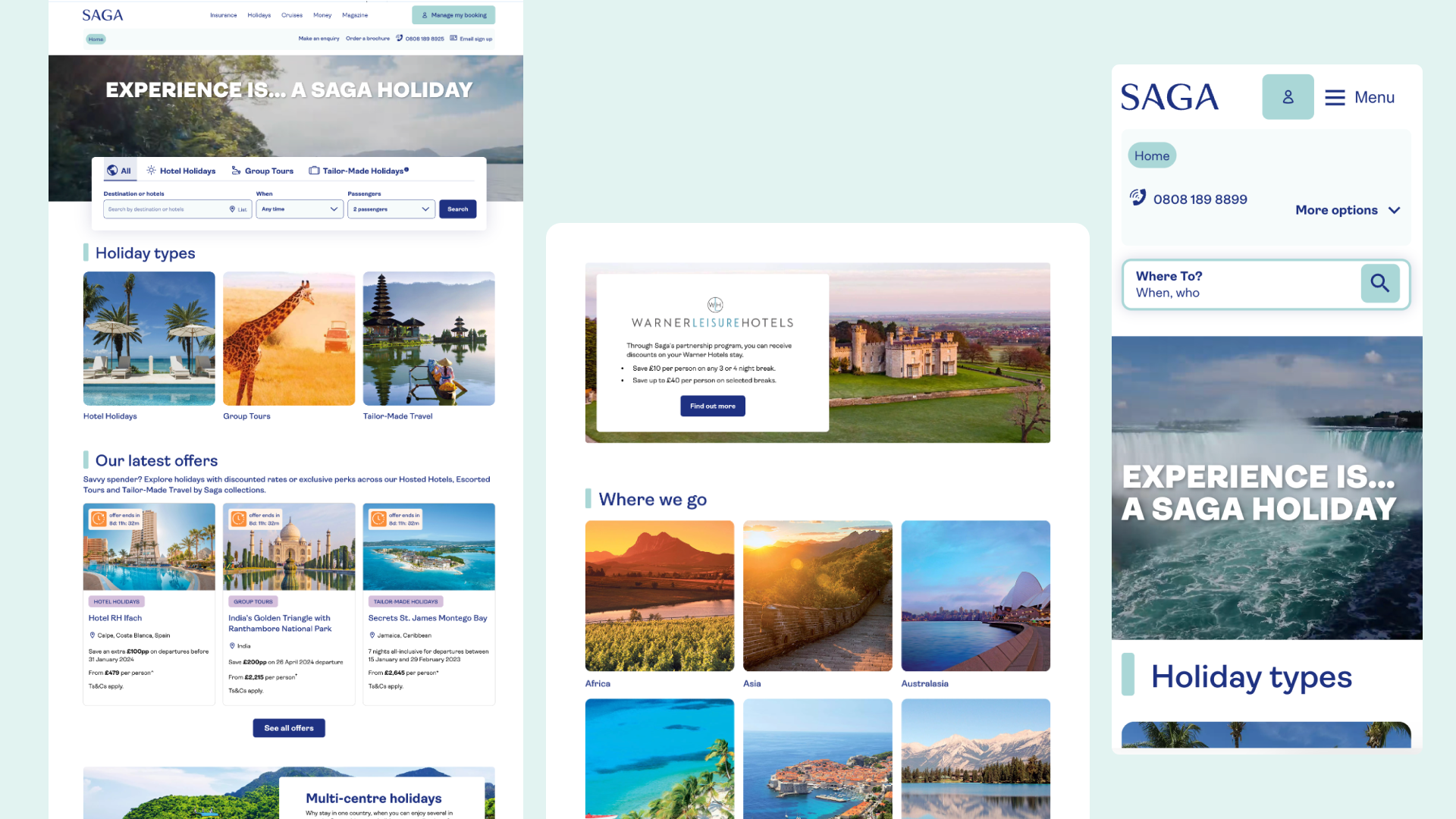
Collaborating closely with the Saga team, a key task for the UX designers was to strategically organise various holiday types into appropriate sections on the website and define the categorisation approach.
During this phase, we collaborated very closely with Saga subject matter experts to design the best ways to showcase the new products, deals and to encourage customers to take the next step in the booking journey.
We freshened the look and feel by using a white base for our colour palette, and then let the different shades of blue from within their new signature marble texture punch through. Plus, we let the holiday imagery shine through, giving visitors the feeling of being at their dream destination, instilling a sense of wanderlust and anticipation.
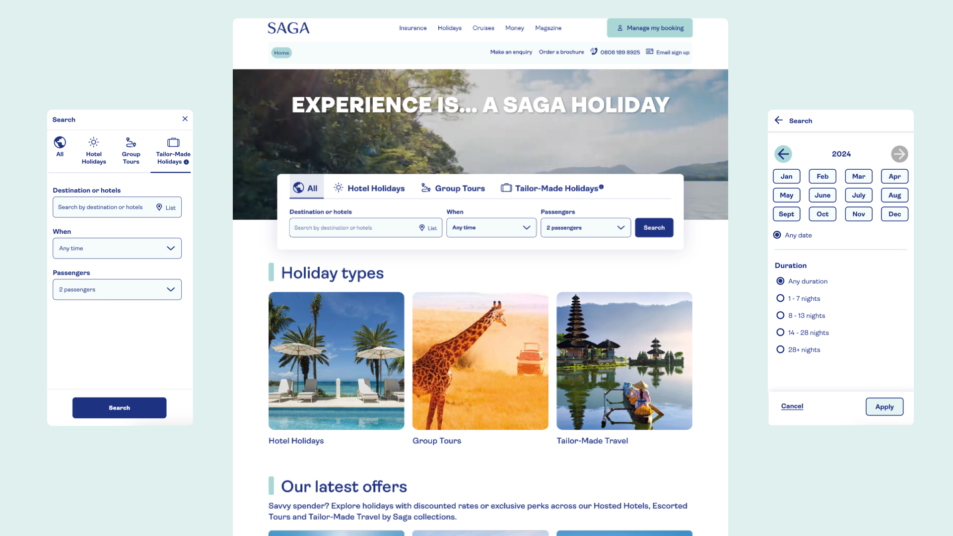
A critical aspect of our design approach was accessibility, particularly catering to an older generation of users. Extensive considerations – such as ability to magnify text without breaking the components, strong colour contrast throughout and ensuring touch-friendly button sizes – were made to ensure that the design acknowledged the importance of being an inclusive and user-friendly interface. All of these design and interaction elements and patterns were then brought together into a new Saga Design System that we created for them to help with scaling and flexing the future of the whole digital platform.
The Impact
We successfully delivered designs for a large number of features and enhancements including:
- Full UI redesign: Bringing vibrancy and brand tones into the experience
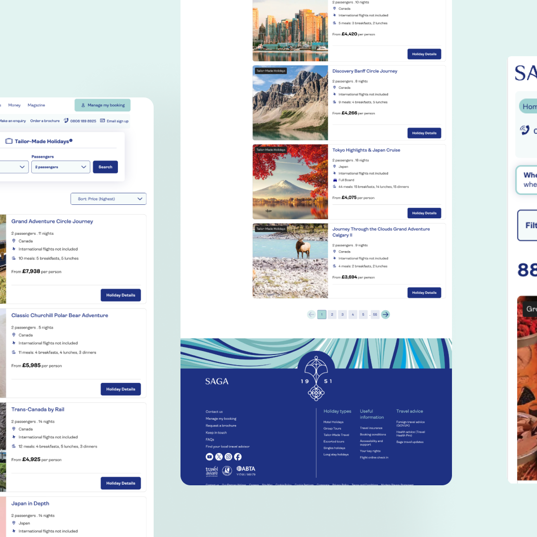
- Search results: Designing easy-to-compare holiday and cruise cards that are quick to scan and make a shortlist from
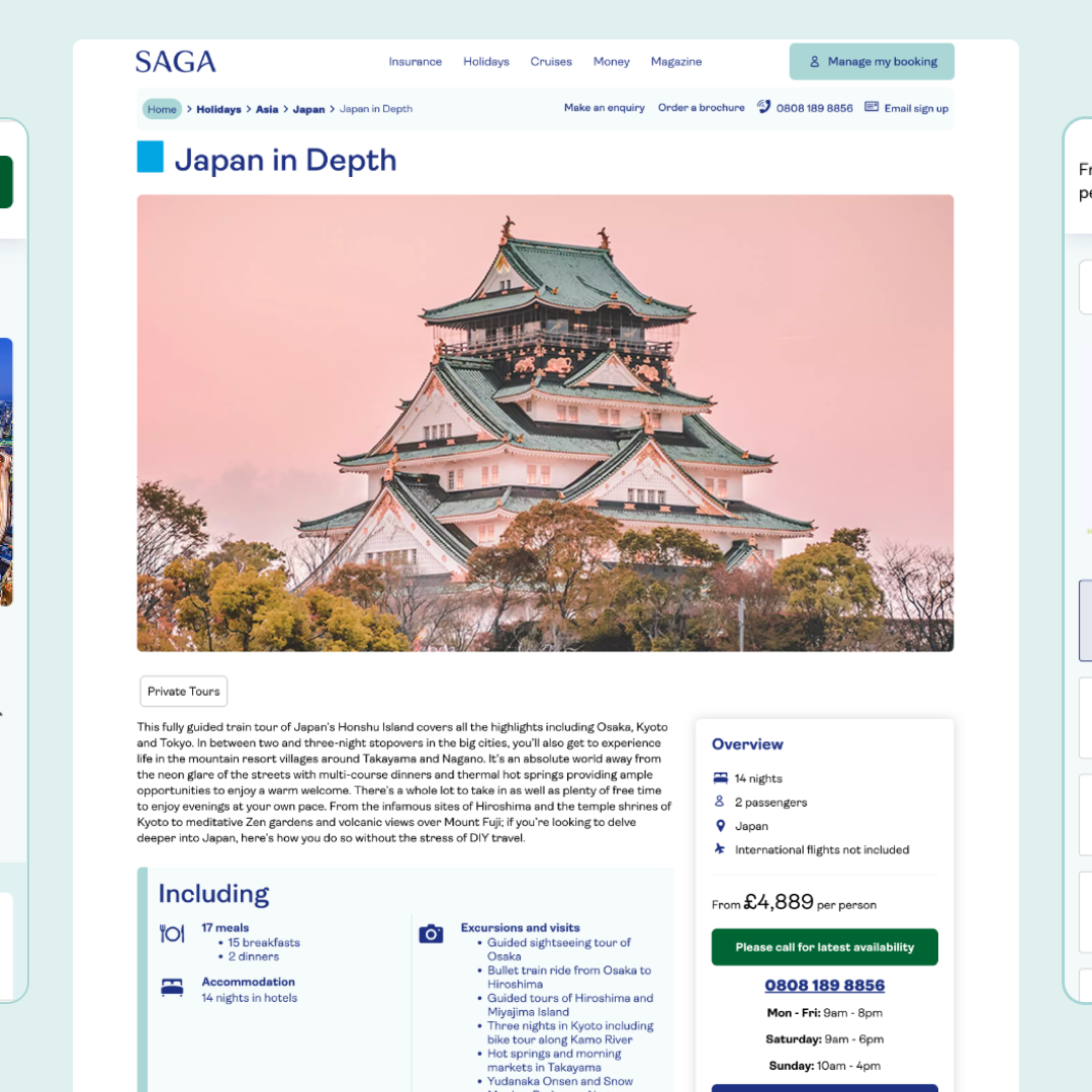
- Holiday details page: Rearchitecting the structure of the page, plus bringing in a quick view ‘Holiday Planner’ panel on the right-hand side to introduce customers to the start of the booking
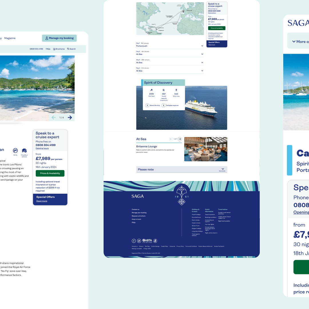
- Cruise details page: Making the page much more engaging, improving the itinerary section, and bringing in the ‘Cruise Planner’ panel on the right hand side, to entice people into the booking journey
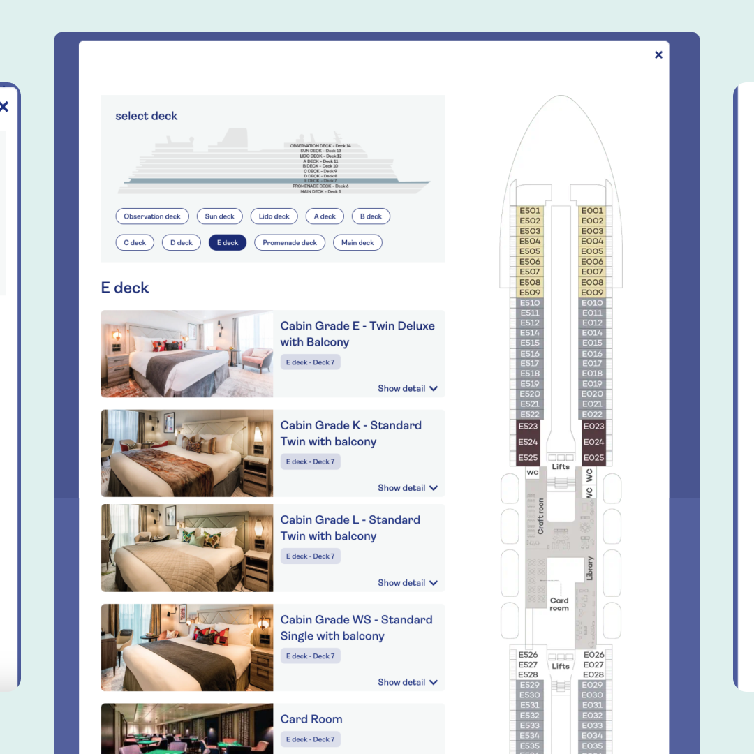
- Ship explorer: A new engaging way to take a look at the Ocean Cruise ships, exploring the rooms and facilities on each deck of the ship
We are incredibly proud of the work, do take a look here:
https://holiday.saga.co.uk/ and https://travel.saga.co.uk/cruises

200+
Components designed

18
User testingsessions

