Accessibility Isn’t Optional — It’s Just Good Design
A Bernadette Perspective on Inclusive Digital Experiences
Whenever Global Accessibility Awareness Day rolls around, we see it less as a reminder — and more as an opportunity. A chance to bring a conversation into the spotlight that, for us, never really stops. It’s a chance to pause, reflect, and re-centre the conversation—not just around compliance or code, but around creativity. Because here’s the thing: accessibility requirements aren’t chores to be grudgingly addressed. They’re often missed opportunities within the design space hiding in plain sight. Yet somehow, certain myths persist.
Chief among them is this old chestnut: “Accessibility is just a checkbox to meet legal requirements.” Except it’s not. We understand that accessibility isn’t fringe—it’s mainstream. One in five people in the UK has a disability. That’s not a niche audience. That’s over 14 million potential customers(1) and a huge slice of your core audience.
It’s the world, as it is—not as it’s been narrowly designed for by a legacy design culture that centres convenience over inclusion, aesthetics over access, and assumes usability for one means usability for all.
When we dismiss accessibility as a legal hoop to jump through, we don’t just let people down — we shut them out entirely. And in doing so, we limit what design can be: not a tool for connection, but a barrier to entry.
We also lower our own creative ceiling. We cut off routes to better UX, smarter content, sharper design. At Bernadette, we believe accessible design isn’t about compromise. It’s about making things better, for more people, in more situations.
So this Global Accessibility Awareness Day, we’re dispelling the myths, rethinking the defaults — and pointing the way toward building digital experiences that actually work for everyone.
Visual Accessibility – It’s Not Just About Screen Readers
Another persistent myth is that “accessibility is simply for people with poor vision”. It’s true that when some people think of accessibility, they might very well think of screen readers, text size and contrast. And that’s about it. Vision in the narrowest sense of the word.
But here’s the truth: visual accessibility isn’t just about blindness. It spans everything from colour blindness to cataracts, partial sight to temporary eye strain — and even environmental factors like bright sunlight, glare, or tricky viewing angles in a moving car. It’s about making sure people can actually see, scan, and understand what you’ve put in front of them — regardless of how perfect their eyesight is (or isn’t) at that time, or where they happen to be.
2,250 out of every 50,000 website visitors have a colour vision deficiency(2). So, what does good visual accessibility look like?
- It looks like high-contrast colour combinations that work in bright sunlight and for users with red–green colour blindness.
- It looks like text that scales smoothly without shattering the layout.
- It looks like image alt tags that describe rather than apologise.
- It looks like a site that holds up under a magnifier, on a projector, on a cracked phone screen.
A smarter way to think about these applications is that it isn’t just altruism. Rather, it’s smart digital hygiene. Better contrast is better SEO. Clearer structure is lower bounce rates. Scalable, readable content is a broader audience who sticks around longer.
When you build with sight in mind—all types of sight—you’re not muddying the picture or diluting the design, you’re sharpening it. This is a clearer lens through which to look at the visual aspects of accessibility design. It’s about having an eye for the different kinds of visual constraints that need to be catered for in order to make your content not just visible, but visible to everyone.
Hearing Accessibility – Design that speaks volumes even on mute
A user’s ability to hear—whether affected by a hearing impairment or a noisy environment—is a crucial factor in accessibility design. And yet, the myth persists: “As long as we’ve got audio, we’re covered.” This assumes that rich, well-produced audio —podcasts, voiceovers, sound cues, music—is enough. That if it sounds good, it is good. But that’s only true if everyone can actually hear it.
The reality? Many users are deaf or hard of hearing. Others process information visually, or are simply in environments where sound isn’t an option — like packed train carriages, busy offices, or the middle of the night with a baby asleep next to them. In fact, 75% of social media videos are watched on mute(3) — meaning if your content depends on audio to make sense, it’s already missing most of your audience.
And if your content doesn’t include captions, transcripts, or visual equivalents of those audio cues? It might be beautifully produced—but it’s effectively silent. Simply put, if your content only works with sound, it doesn’t fully work as well as it could.
So what does better sound accessibility actually look like?
- It means adding subtitles to every video, not just the polished campaigns.
- It means including transcripts for audio—interviews, podcasts, explainers—so users can scan, quote, revisit.
- It means designing in clear visual prompts for sounds — whether that’s a persistent alert, a soft visual cue, or a notification that’s easy to spot without relying on audio alone.
- And where possible, offering alternative formats—from written recaps to text-based customer service chats.
These fixes are simple, scalable, and highly effective. They improve comprehension, increase engagement by opening the door to millions more users. And when these accessibility components are done well, it ensures that brand communications still ring true —even when the sound is turned all the way down.
Touch & Motor Accessibility – It’s Not All Point and Click
Here’s a myth that quietly creeps into design decisions all the time: “Everyone uses tech the same way.” Click the button. Swipe the screen. Tap to confirm. Easy, right?
Well, that depends. This kind of thinking assumes every user has full dexterity, steady hands, and the physical ease to interact with digital devices exactly as intended.
But that’s not reality.
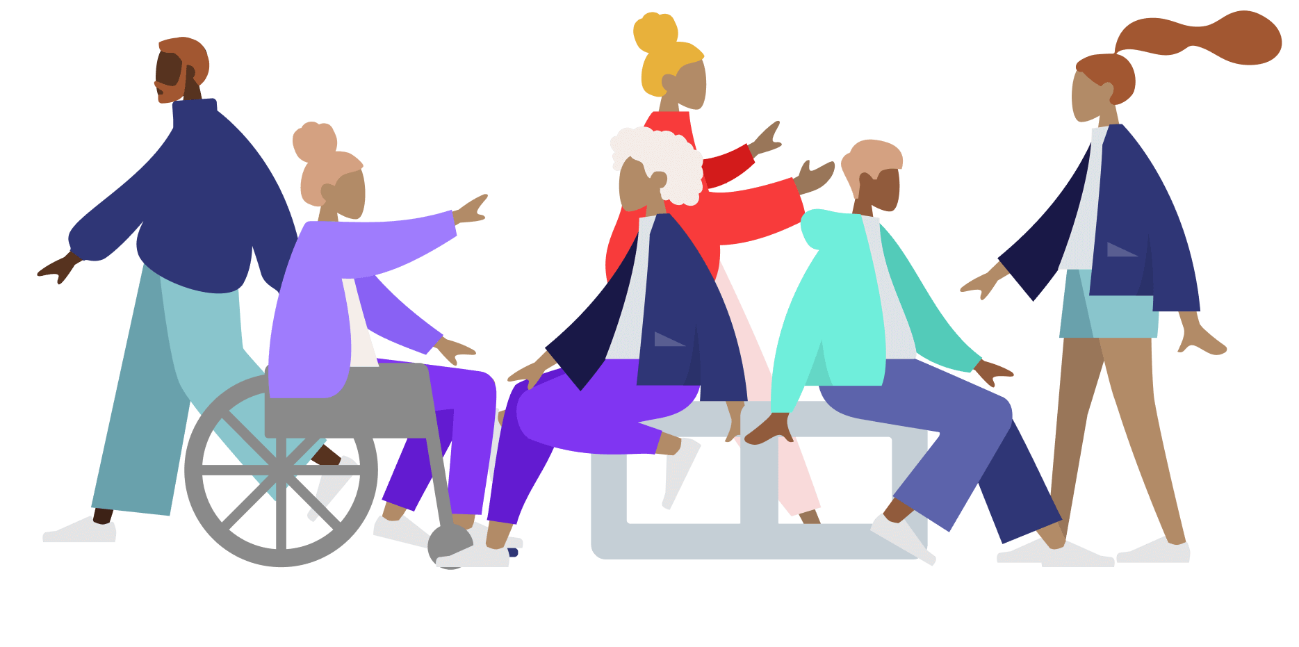
Many people live with motor impairments that affect how they use tech—from Parkinson’s and cerebral palsy to arthritis, MS, or temporary injuries. In the UK, mobility is the most frequently reported impairment—affecting 48% of disabled individuals(4). Some cannot use a mouse, while others rely entirely on keyboard navigation, voice commands, or adaptive hardware to get around a screen.
When forms are fiddly, buttons too small, or interactions rely on complex gestures, the experience becomes frustrating — or flat-out inaccessible. And the cost is real: 72% of users have abandoned a purchase because of poor accessibility(5).
So what does accessible interaction design look like?
- It looks like clearly labelled, easy-to-reach buttons that don’t require pixel-perfect precision.
- It looks like keyboard-friendly navigation that moves smoothly through forms, menus, and buttons — without needing a mouse.
- It looks like reduced motion requirements, with no need for swiping, dragging, or two-fingered anything.
- It looks like input fields that don’t time out mid-entry — especially when typing takes longer.
These aren’t fancy extras. They’re design basics that widen access, boost usability, and remove needless friction for everyone—including someone tapping with a thumb on a bumpy train. Because when digital design assumes a single way of interacting, it doesn’t just fail some people—it shrinks your entire audience.
Language, Literacy & Speech – If They Can’t Read It, They Can’t Buy It
Another myth that quietly shapes digital projects is the assumption that general audiences are fully up-to-speed with technical concepts and possess flawless reading comprehension: the idea that “our audience is tech-savvy and hyper literate.”
Low literacy rates, second-language speakers, and users with learning difficulties are everywhere—in fact, 8,200 out of every 50,000 site visitors in the UK have low literacy7. But there’s no neat metric that tells you why someone gave up — whether it was a wall of jargon, a confusing instruction, or a checkout flow that left them second-guessing their next step.
Accessibility here isn’t just about who can technically click through your experience. It’s about who feels confident doing it. This demands a clear and considered approach to UX copywriting—optimising language to perform across a wide and varied reading audience.
So what does better look like?
- Simplicity: Use short, direct sentences with everyday words—without sacrificing meaning or tone.
- Consistency: Stick to familiar terms and patterns across all pages to reduce cognitive load.
- Clarity: Prioritise instructions, CTAs, and key messages visually and verbally—no burying the lead.
- Supportiveness: Provide context when needed (tooltips, prompts, hints) so users aren’t left guessing.
Because accessible language doesn’t mean dumbing things down—it means opening things up. Making every message easier to follow, every action simpler to take, every user more confident in what they’re doing. It’s about writing in a way that works for everyone—just like this.
Neurodivergent Accessibility – Creativity Needs Room to Think
Neurodivergent people—including those with ADHD, autism, dyslexia, and more—engage with digital spaces in ways that aren’t always linear or predictable. It’s easy to assume that catering for such a broad and complex range of needs would inevitably compromise good design—giving rise to the myth that “accessibility limits creativity.”
But this idea—that designing for inclusion somehow strips away the artistry…flattening digital experiences into something plain and predictable. But that’s not how creativity works — and it’s not how we design.
When you actually listen to what neurodivergent users need—clarity of structure, consistency of patterns, freedom from cognitive overload, and the ability to control distractions like autoplay videos, flickering animations, and chaotic layouts—it doesn’t stifle creativity.
With only 31% of autistic adults in the UK currently in employment(6), the stakes are real and there’s a demand for designers to find smarter, sharper solutions that ultimately benefit a broader share of your audience.
This is where neuro-inclusive design principles come into their own, reinforcing fundamentals such as:
- Clean, intuitive layouts where content flows logically.
- Error-tolerant forms that forgive mistypes and missed clicks.
- The ability to pause, control, or disable movement and animation.
- Simple, direct language that respects attention rather than assuming it.
The best digital spaces aren’t built for a mythical “average user.” And, just like the most iconic design principles in history have taught us—when you design for difference, you often end up making something better for everyone.
The Big Myth — Why Accessibility Isn’t Optional (or Boring)
At the root of a lot of digital inertia is this over-arching, self-defeating myth: “Accessibility is expensive, boring, and not my problem.”
It’s this kind of thinking that frames accessibility as an optional extra—a nice-to-have if there’s budget left over, or a grudging compliance exercise when there isn’t.
At Bernadette, we’re focused on turning this perception on its head, and reframing accessibility as a welcome safeguard, a growth strategy, and a creative unlock—all rolled into one. And, when it comes to cost, you can take our word for it… It’s far cheaper (and far less painful) to design accessibly from the outset than it is to retrofit it later. That’s because 71% of users with disabilities will immediately abandon a site that isn’t accessible, costing UK businesses an estimated £17.1 billion annually in lost revenue(8).
And the idea that accessible design is boring? Well, a good sense of imagination and an inspired approach to solving problems explodes this final myth like a firecracker in a quiet room. Sure, leave accessibility in the hands of the uninspired, and yes—you might get a bit of dull, box-ticking work that doesn’t really know what it’s doing. (Spoiler: we know what we’re doing.)
Truthfully, we don’t think accessibility should be anyone’s ‘problem.’ Rather, it should be approached as a solution and an opportunity to push design in digital experience further.
So… Why Work With Bernadette?
Got a business challenge that’s looking for an innovative digital solution? Or, perhaps you’re interested in joining our collective of digital pioneers? Maybe you just want to know a little more about what we do. In any case, we’d love to hear from you.
Ready to See How Your Site Actually Performs?
Want to know how your digital experience stacks up—not just for ‘ideal’ users, but for real people, in the real world? Let’s find out.
Book an accessibility audit with Bernadette. We’ll show you where the barriers are, where the opportunities lie, and how a few smart changes could open up your brand to a much wider audience.
Just honest, practical insight—and a clear path to making your digital spaces stronger, sharper, and more inclusive.
- https://wearepurple.org.uk/understanding-the-purple-pound-market/
- https://www.colourblindawareness.org/colour-blindness/
- https://digiday.com/sponsored/75-percent-of-people-watch-mobile-videos-on-mute/
- https://researchbriefings.files.parliament.uk/documents/CBP-9602/CBP-9602.pdf
- https://wearepurple.org.uk/understanding-the-purple-pound-market/
- https://www.gov.uk/government/news/employment-prospects-for-neurodiverse-people-set-to-be-boosted-with-launch-of-new-expert-panel
- https://literacytrust.org.uk/parents-and-families/adult-literacy/
- https://clickawaypound.com/downloads/