O2
Oxygen Design System
Creating a more human-centered design system involves putting people and their needs at the forefront of your design process
The Challenge
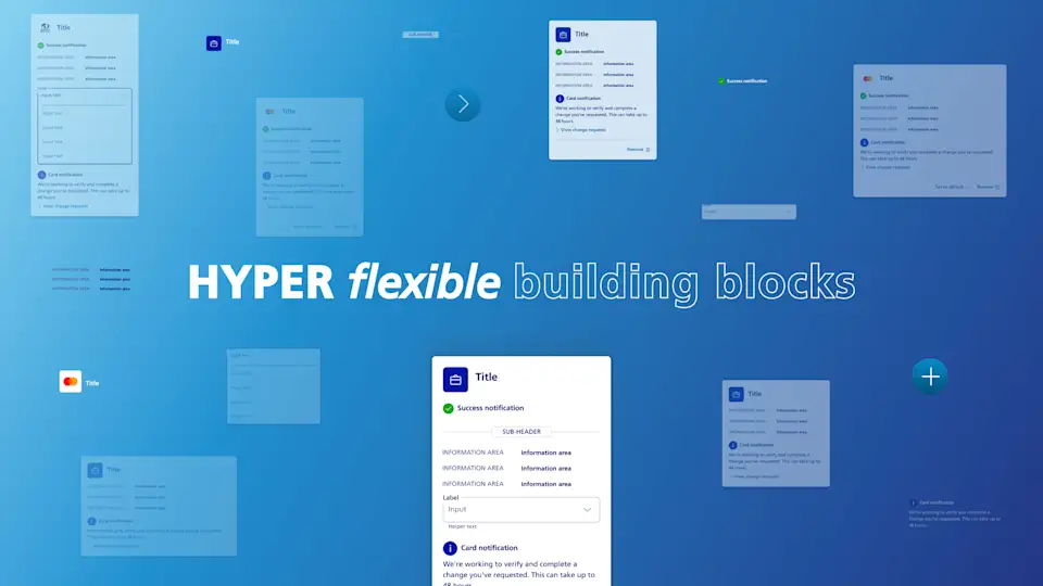
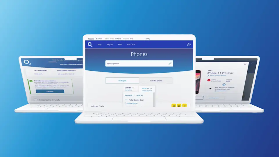
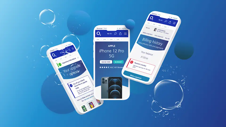
The Oxygen Design System (ODS) includes UI components and templates, as well as best practice documentation on how to leverage the power of cutting edge technology in figma to provide a single source of truth for building user-friendly interfaces and layouts, and journeys across the O2 ecosystem
We have taken the O2 design system from Photoshop to Sketch and now to Figma. By doing this we were able to enhance consistency and accessibility across each migration. The O2 design system included brand properties such as colours, typography, spacing, shadows, and more – providing the foundations for components and other elements that make up the flows that support some complex services and features across the O2 UX. Together with featurs in figma, and a well thought out system architecture, we improved our design and development collaboration, streamlined the design process, and enhanced the overall user experience output by maintaining a cohesive look and feel. Implementing a new design token system served as a bridge between design and development, allowing for consistent and efficient application of design elements throughout all our digital products and platforms.
The Solution
Migrating the O2 design system from Sketch to Figma was a challenging process, but it was hugely necessary to accommodate collaborative workflows, improved version control, and cloud-based accessibility.
Here are some of the key challenges we overcame:
Design Tokens: If your design system uses design tokens (variables that store design properties like colors and typography), you’ll need to update these tokens to match Figma’s newer format, ensuring that designs stay consistent. We created a solid theory around design tokens which could be translated across a number of different products, and brand scenarios.
Symbol and Component Mapping: Sketch symbols and Figma components don’t always map perfectly due to differences in how these tools handle nesting, overrides, and interactions. We defined a new component naming structure that was scalable and easily replicated across our whole design system. Having this set early within the process allowed more designers and developers to contribute and collaborate.
Collaboration and Sharing: One of the primary reasons for migrating to Figma was its collaborative capabilities. Transitioning the design system to Figma required setting up appropriate sharing permissions and workflows, which was a very complex process – but worth the time.
Feedback and Iteration: After migration, feedback from our users and stakeholders highlighted areas where the design system could improve or be refined. We managed this feedback through Jira and baked it into our sprints. This allowed more designs to pick up and learn the system.
Documentation Update: We updated existing design system documentation to reflect the migration to Figma, this included integrated guidelines, a versioning system, and usage instructions within our Figma projects.
We wanted to shy away from scientific terms to describe the system. We still used atomic design principles but found clarity in naming our pillars: foundations, components, patterns, and templates. A more simplified and understandable approach to an already complex process.
Chief Design Officer
The Impact
In summary, the adoption of a design system at O2 had a profound and positive impact our workflows - enhancing efficiency, consistency, and collaboration, while also leading to significant cost savings and scalability as digital transformation projects needed to increase in velocity.
We implemented a design system to standardise O2 designs, including UI elements, typography, colours, and more. This consistency significantly improved the efficiency of the design and development teams. Designers could easily reuse pre-defined components, while developers could quickly implement them in code. As a result, project turnaround times were reduced, and the company could bring new products and features to market faster.
The design system included updated versioning control, making it easy to track updates and changes. This ensured that all teams used the most up-to-date design components and guidelines, reducing the risk of inconsistencies.
The design system was instrumental in fostered collaboration between O2 design and development teams. Both teams used a shared language, which eliminated misunderstandings and improved cross-functional communication. This collaborative approach resulted in smoother workflows and a more cohesive end product.
Before adopting a design system, O2 faced issues with design inconsistency. Different teams and designers had their interpretations of design elements, leading to a lack of visual cohesion across their products. Oxygen introduced a single source of truth, ensuring that all digital touchpoints adhered to the same design guidelines. The features of the figma platform helped to amplify the ways to maintain consistency – improving the user experience but also strengthened the brand identity, and team dynamic in making digital products across the O2 ecosystem.
