Redesigning a smile: Müller’s New Digital Experience
The Challenge
Müller is one of the most loved food brands in the UK, but its consumer website wasn’t doing it justice.
As a shop window it faced multiple challenges: low discovery, a fragmented experience, and a structure that made exploring anything beyond the familiar favourites — like Müller Corner and Müller Light — a little difficult.
With a navigation based on static categories instead of real consumer needs, visitors would arrive, browse a page or two, and leave without uncovering anything new. No fun at all.
Visually, the site also fell short of expressing the brand’s natural sense of play. Content was sparse, moments of delight were missing that iconic Müller smile, and the brand’s inherent warmth and humour simply wasn’t coming through.
So, the challenge was clear: turn the website into a discovery-first experience that brought play to every interaction. A digital home fit for a brand already loved in millions of fridges.

The Approach
We began by reframing the website’s role within Müller’s wider digital ecosystem strategy, shifting it from a passive presence to an active Discovery & Exploration Hub.
That meant redesigning the experience from the ground up, revisiting the product categories to better address how customers actually shop and snack, and surfacing relevant ranges users were less aware of — such as protein products and shakes.
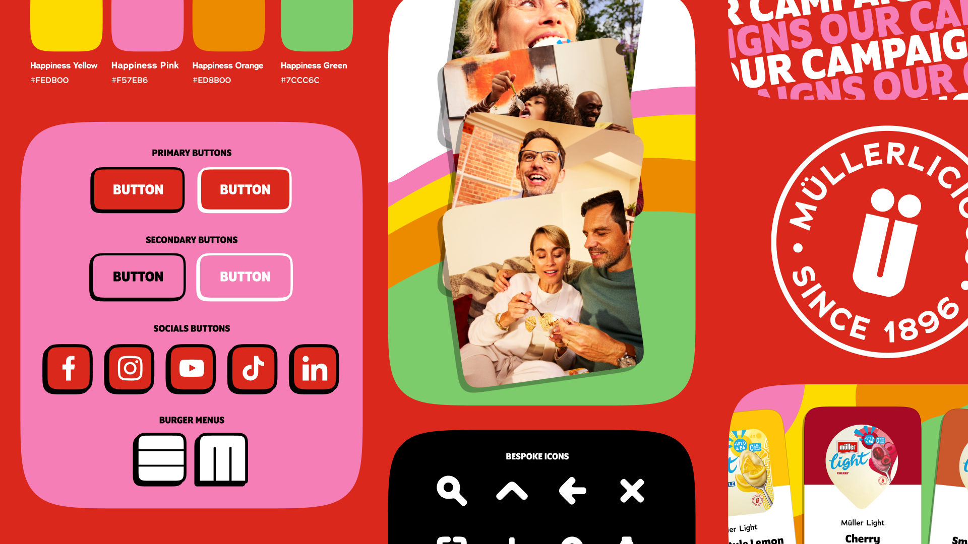
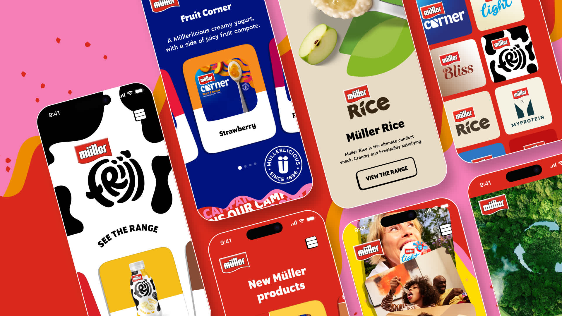
We paired this structural rethink with elevated visuals and a refreshed design language that was uniformly fun and ‘Müllerlicious’, while still giving each part of the product line its own distinctive character. From Low Fat and High Protein to Chocolate and Strawberry, the new approach ensured every product had its own space to shine.
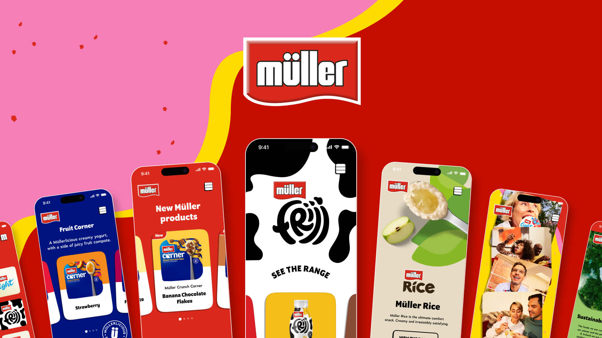
The journey naturally began on the homepage, so we poured a lot of energy into transforming it into a playful and inviting experience that encouraged users to immediately interact with the range, explore recipes or find out more about Müller as a company.
This UI philosophy carried throughout the experience, creating a joyful, coherent brand world through expressive typography, motion and creative use of colour,adding personality to every interaction.
At the same time, we added more flavour to the content, rewriting category, range and brand pages in a voice that leaned into Müller’s natural playfulness while still balancing clear product information, calls to action and optimisation for both traditional and AI search.
To ensure every detail translated cleanly into code, we delivered a development-ready component library with interaction and motion guidance and strong accessibility foundations. This gave F7, our development partners, everything they needed to bring the design to life seamlessly.

The Impact
The result is a website that finally reflects the brand people already love: fresh, playful and inviting.
A consistent digital masterbrand now ties everything together, with refreshed content bringing a lighter, brighter and unmistakably Müller tone to every page.
Through our mood-based navigation we’re already helping more people explore Müller’s world, explore new products and flavours and find out where they can shop.
Taken together, the new experience marks the beginning of a broader digital evolution for the brand — starting with a website designed to put a smile on the nation’s face, one joyful interaction at a time.
Let's talk
Got a business challenge that’s looking for an innovative digital solution? Or, perhaps you’re interested in joining our collective of digital pioneers? Maybe you just want to know a little more about what we do. In any case, we’d love to hear from you.
