Bear in mind…ways to create accessible and inclusive designs
Global Accessibility Awareness Day is celebrated in May each year, and is an important date in the diary celebrated by our Accessibility Collective. Well, today is the day and this year we’re bringing to you some things to ‘Bear in mind’, so as to help guide you in creating more accessible and inclusive designs.
Design is hugely wide-ranging, from website and apps, to communications design from social posts and print adverts, to presentation decks and emails — and of course much beyond this too.
But what does ‘accessible and inclusive design’ actually mean?
Accessibility is all about giving people the ability to access information and services by allowing them to better use and understand a design. You may be forgiven for thinking this principle applies simply to people with certain disabilities — which it does — but in reality accessible design benefits everyone. Afterall, no one likes yellow text on a white background right?
Inclusive design is even broader, and is all about making sure that no one feels excluded, perhaps by the language or images used, or the form fields available for gender selection, as examples.
So, to make things a little easier for you to get started, or continue on your journey to deliver accessible and inclusive design, we’ve put together a set of pointers for you to ‘Bear in mind’ when creating design work…
Bear in mind...
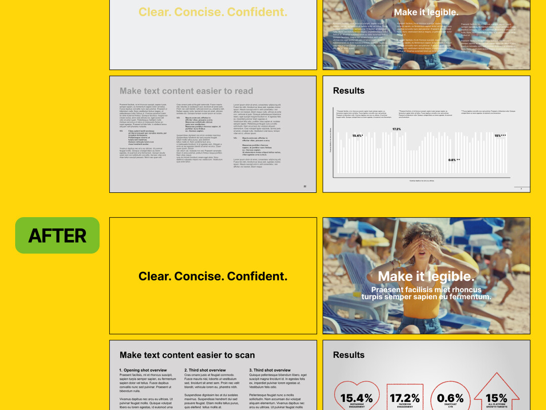
Presentation decks should paint a clear picture Decks look better for everyone when you use text colours, sizes and fonts that show up clearly against backgrounds, with large enough images and simple layouts. Don’t let your slideware end up looking like diagrams for a fusion reactor.
Bear in mind...
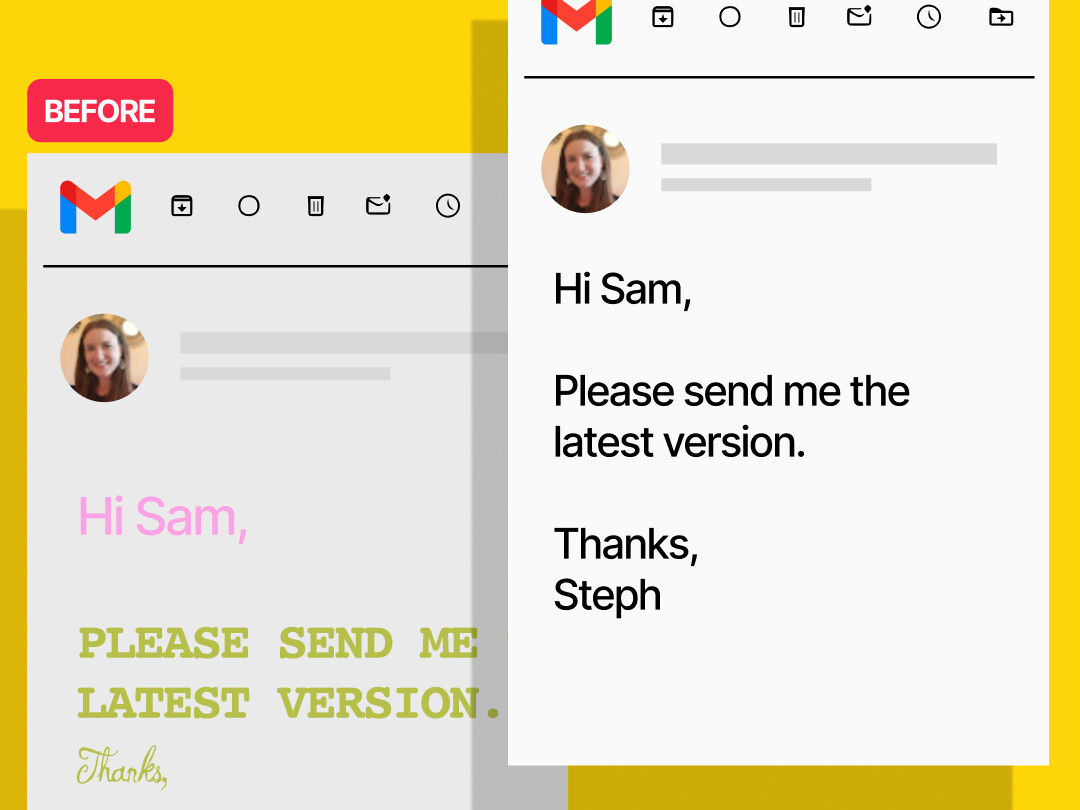
Well-formatted emails are easier to digest Use legible text sizes - typically 12pt or above, standard sans serif fonts and underlined links. Also, let’s avoid using poorly contrasting colours, and UPPERCASE BECAUSE IT LOOKS LIKE YOU’RE SHOUTING ARGHH!!!
Bear in mind...
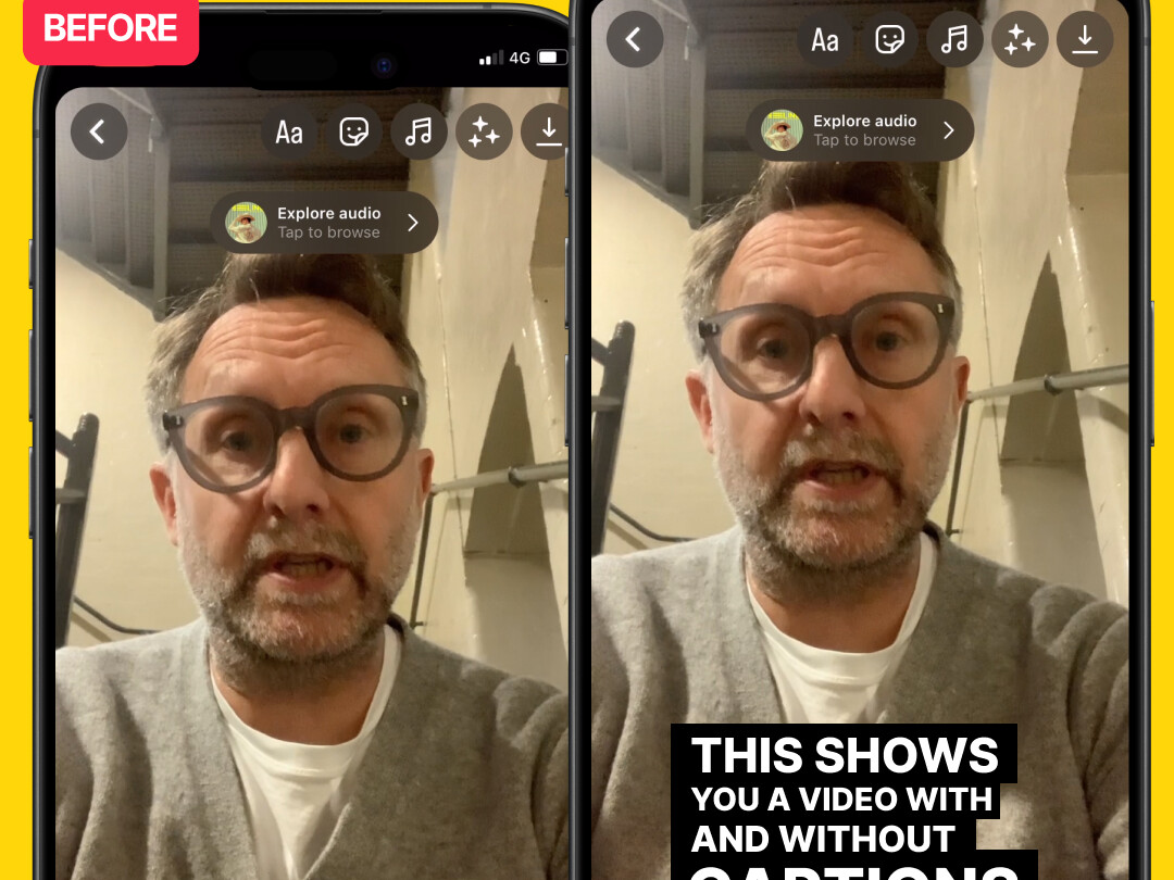
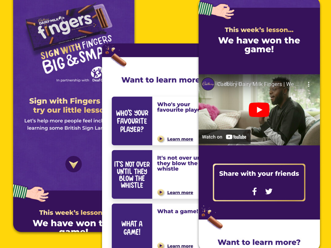
Some people can't hear the sound When posting a video, make an effort to provide an option for closed captions or subtitles. If you’re creating a video with a voiceover, try to make sure your music cues don’t interfere or distract from the spoken word.
Bear in mind...
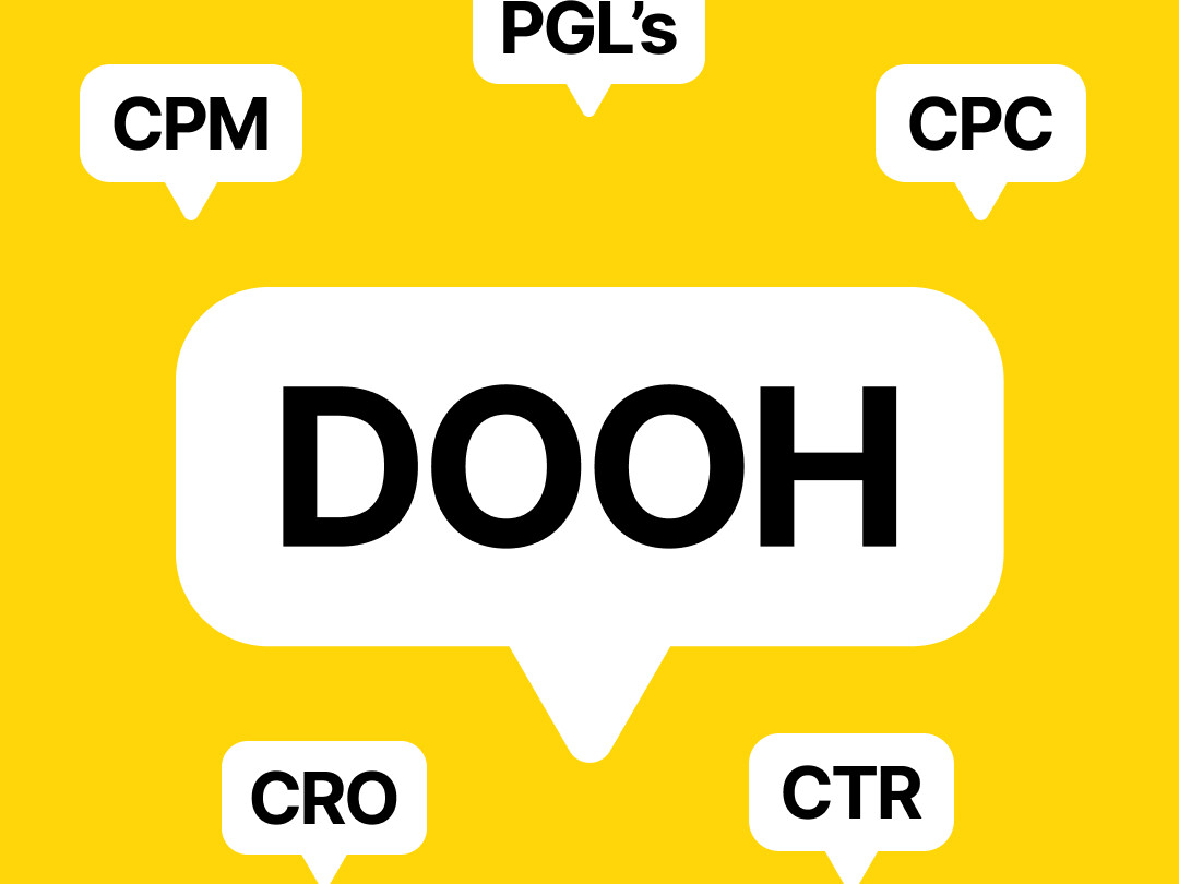
Jargon and acronyms can confuse matters Not everyone has the same knowledge of the topic in hand, so keep jargon and acronyms to a minimum and use words that sound human. So rather than "Solutions to maximise NPS in each vertical.” Someone may better understand... “Solutions to improve how people feel about our brand in each industry.”
Bear in mind...
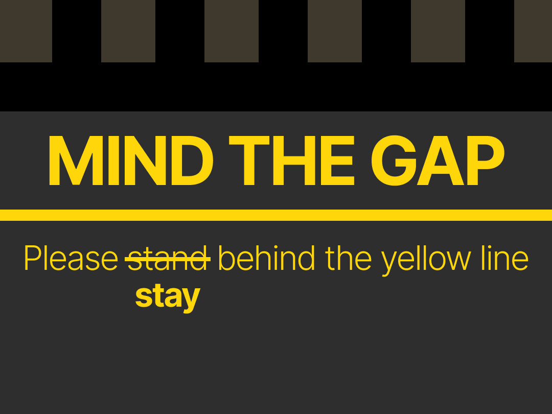
Websites and apps need to work for everyone Designing a website? Try to ensure ALL your visitors can interact with the content — by keeping things simple, ensuring good colour contrast, removing obstructions, and optimising navigation. Making sure websites and apps are accessible is the right thing to do, and is soon to be a legal obligation.
Bear in mind...
Using empathetic language makes everyone feel included Know your audience. That means being mindful of the people you’re talking to and shaping your language to accommodate their lived experiences. This approach helps us become more naturally empathetic while avoiding non-inclusive and hurtful phrases.
Bear in mind...
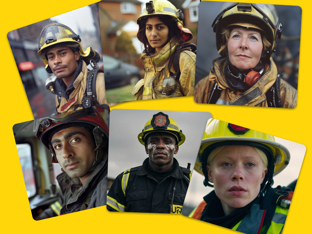
Avoid giving into stereotypical representations of people Stereotyping of people exists for a variety of reasons — all of us exercise degrees of unconscious bias. Being aware of this, let’s challenge problematic stereotypical thinking in a way that’s sensitive, respectful and without judgement.
Bear in mind...
Involving your audience can help create authentic representation By giving your target audience early involvement in the research and development process, you’ll be able to give them more effective representation. If people from your audience are hard to find, we recommend working closely with relevant organisations, whether it’s our DE&I Collective, RNIB, Stonewall, or another that supports marginalised groups.
Bear in mind...
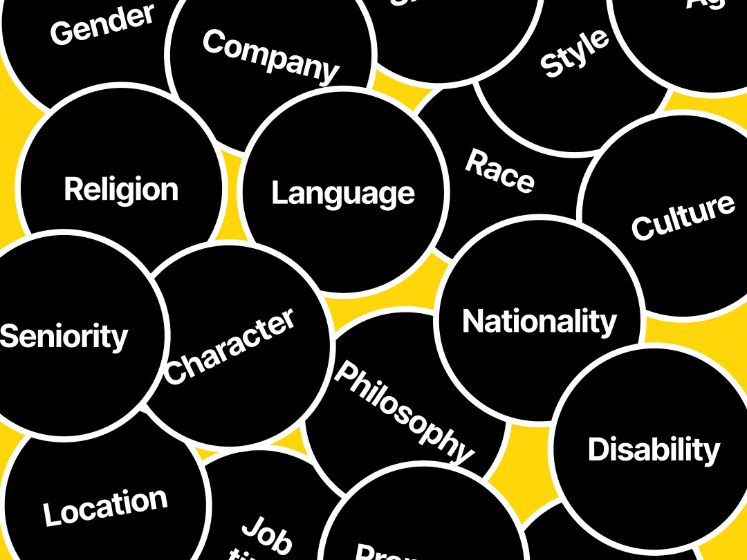
Diversity of people throughout the creative process makes for great work Inclusivity means giving people of all backgrounds an opportunity to take the stage — and work behind the scenes as well. An inclusive creative project is one that allows everyone to write, manage, direct, engineer, or appear in, regardless of gender orientation, ethnicity or culture. Keep this in mind when recruiting your team.
Bear in mind...
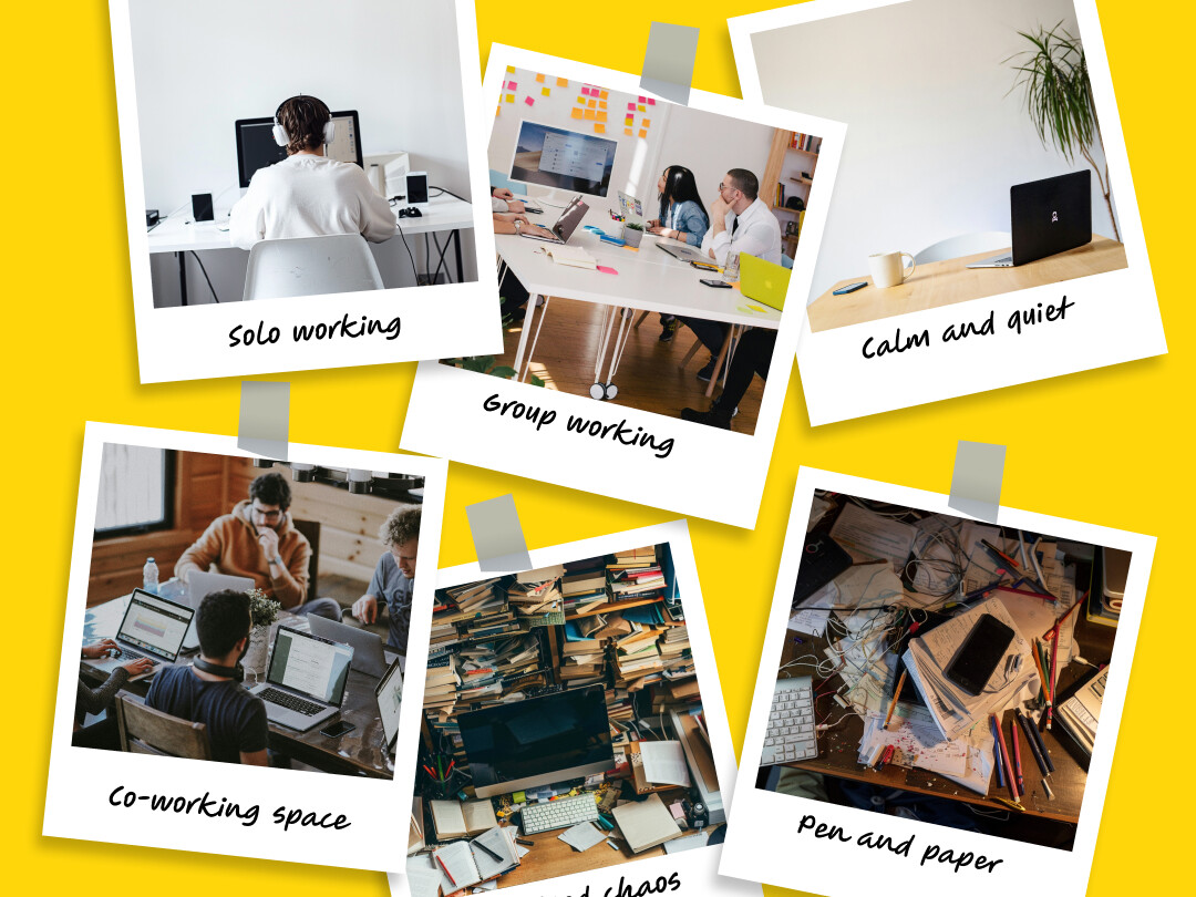
We don’t all work the same way People like to take different approaches to reaching the same creative output. Some people like big meetings, others like one-to-ones, some like flexibility while others like structure. Let’s try to communicate so we understand each other's needs.
We hope these pointers help you to make improvements to how you approach design going forwards, and if you’re ever not sure the best approach, just ask for help – that’s what inclusive design is all about.
Enjoy!
Bernadette Accessibility Collective x VCCP DE&I Collective x Girl&Bear